Studio Window No. 04
What makes a brand look high end without the high end budget
ELYSA - ERANOVA DESIGN MAY 11 2026 12 MIN READ
The brands that look expensive are almost never the ones that spent the most money. They are the ones that made the most intentional decisions.
I want to start by saying something that might be a little uncomfortable to hear. A lot of what makes a brand look cheap has nothing to do with budget. It has to do with choices. Too many colors. Too many fonts. Too much information crammed into too little space. Too much trying to say everything at once and ending up saying nothing clearly.
I see this constantly with wellness and small business brands. A business owner builds their own website, does their own branding, and without realising it makes a handful of common design mistakes that signal to every visitor that this was not designed by someone who knew what they were doing. And the visitor clicks away before reading a single word.
The good news is that every single one of those mistakes is fixable. And none of the fixes cost money. They just require knowing what to look for. This post covers the six design principles that consistently separate brands that look high end from brands that look budget, a before and after comparison to show those principles in practice, and a quick brand audit you can run on your own website today.
— THE SAME BRAND TWO VERY DIFFERENT IMPRESSIONS —
Same brand. Same product. Completely different impressions.
Before we get into the principles it helps to see them in action. Look at the comparison below. Same fictional brand. Same product. Same niche. The only difference is the design decisions behind each one.
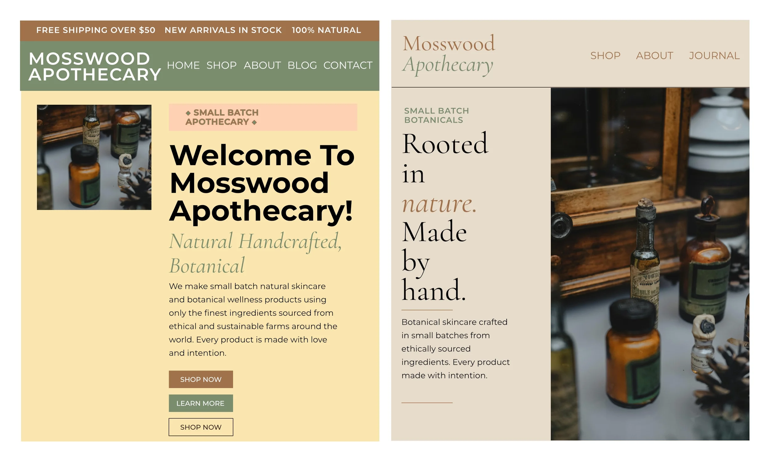
Same brand. Same product. The only difference is the design decisions behind it. Left is what happens when everything gets added. Right is what happens when everything gets edited.
The left version is not wrong in its intention. Every element on it is there for a reason. The badges communicate values, the buttons give options, the announcement strip shares a promotion. But all of it together creates visual chaos. The eye does not know where to start so it does not start at all.
The right version has less on it. That is entirely the point. Every element that is not absolutely necessary has been removed. What remains has room to breathe and a clear job to do. And because of that the brand immediately feels considered, premium, and trustworthy.
That transformation did not require a new logo or a custom photographer or a more expensive website platform. It required editing. And editing is a skill anyone can learn.
— SIX PRINCIPLES THAT SEPERATE CHEAP FROM EXPENSIVE —
Six design principles that make a wellness brand look high end
These principles apply to every wellness brand regardless of niche, budget, or how long you have been in business. They are not design secrets. They are design disciplines. The difference between a brand that looks expensive and one that does not is almost always how consistently these principles are applied.
High end brands almost always work with a restricted palette. Two to three colors maximum used consistently across every touchpoint. One dominant background color, one text color, one accent used sparingly. The moment you add a fourth or fifth color the design starts to feel busy and unpredictable. The eye has nowhere to rest and nothing to return to. Pick your palette and commit to it everywhere — your website, your business card, your social graphics, your documents. Consistency is what makes a limited palette feel intentional rather than bare.
One serif for headings and display text. One sans serif for body copy, labels, and buttons. That is the entire system. Mixing three or four fonts is one of the fastest ways to make a brand look unpolished regardless of how beautiful each individual font is. The two font rule applies to everything — your website, your business card, your social graphics, your email signature. When every piece of content uses the same two fonts in the same way the whole brand starts to feel like it was designed rather than assembled.
Padding, margins, line height, the gap between sections — all of it should be more generous than your instinct tells you. Whitespace is not wasted space. It is the thing that makes everything else feel intentional. If your design feels a little empty you are probably getting closer to right. The brands that look expensive are the ones that are not afraid of empty space. They trust that what they have is enough and they give it room to prove that rather than filling every corner to compensate for doubt.
Three buttons in a hero section is not giving the visitor options. It is creating indecision. High end brands know exactly what they want the visitor to do next and they ask for one thing at a time. Shop now or learn more or book a call — not all three in the same breath. Every time you add a second call to action you dilute the first one. The question to ask about every button on your website is what is the single most important action this visitor could take right now. Then ask for that and only that.
Most brands underestimate how much work good typography does. A well chosen serif headline at the right size with the right line height and letter spacing conveys more about your brand than any logo or color choice. The brands that feel most premium are often the ones with the most restrained visual elements and the most considered typography. Size, weight, spacing, and the relationship between your headline an
“Premium design is not about what you have. It is about what you choose to leave out.”
— A QUICK BRAND AUDIT YOU CAN RUN TODAY —
A quick brand audit for your wellness website
You do not need a bigger budget to apply any of these principles. You need a clearer eye. Go look at your website, your business card, your social profile right now. Ask yourself these five questions honestly.
If you answered those questions and felt uncomfortable about any of them that is actually a good sign. It means you can see clearly what needs to change. And seeing it clearly is always the first step.
Most brands improve dramatically not by adding something new but by taking something away. A logo without the tagline underneath it. A hero section with one button instead of two. A color palette reduced from five to three. These are not design skills. They are editing skills. And editing is something anyone can learn.
Why this matters specifically for wellness brands
Wellness brands carry a particular responsibility when it comes to how they show up visually. Your brand is making an implicit promise about the experience of working with you — that it will be thoughtful, considered, and unhurried. A cluttered website undermines that promise before a visitor has read a single word. It communicates the opposite of what your practice is about.
The brands that look expensive in the wellness space are not the ones with the biggest photography budgets or the most sophisticated websites. They are the ones that made deliberate choices and had the confidence to leave everything else out. That confidence is available to every brand regardless of how much they spent on their logo or their website or their business cards.
It starts with one decision. Then another. And then another. Until the whole thing feels like it was designed on purpose, because it was.
The Eranova Design template collection is built on every one of these principles. Every layout, every color choice, every font decision made with intention.
Browse the templates