Studio Window No. 05
5 design trends your wellness brand should be paying attention to right now
ELYSA - ERANOVA DESIGN MAY 20 2026 12 MIN READ
Design trends are not about chasing what is new. They are about understanding what is resonating with people right now and asking whether any of it belongs in your brand.
I spend a lot of time looking at what is working in wellness and executive coaching design. Not because I think every brand should follow trends. Most should not. But because trends reveal something about what people are responding to emotionally. And in branding emotional response is everything.
The five trends I am watching right now are not arbitrary. They are all moving in the same direction; toward more humanity, more restraint, and more confidence. And every one of them is within reach for a small wellness or coaching brand without a big budget or a custom designer.
This post breaks down each trend, explains why it is resonating in the wellness space specifically, and gives you one concrete action you can take to apply it to your brand today without starting over.
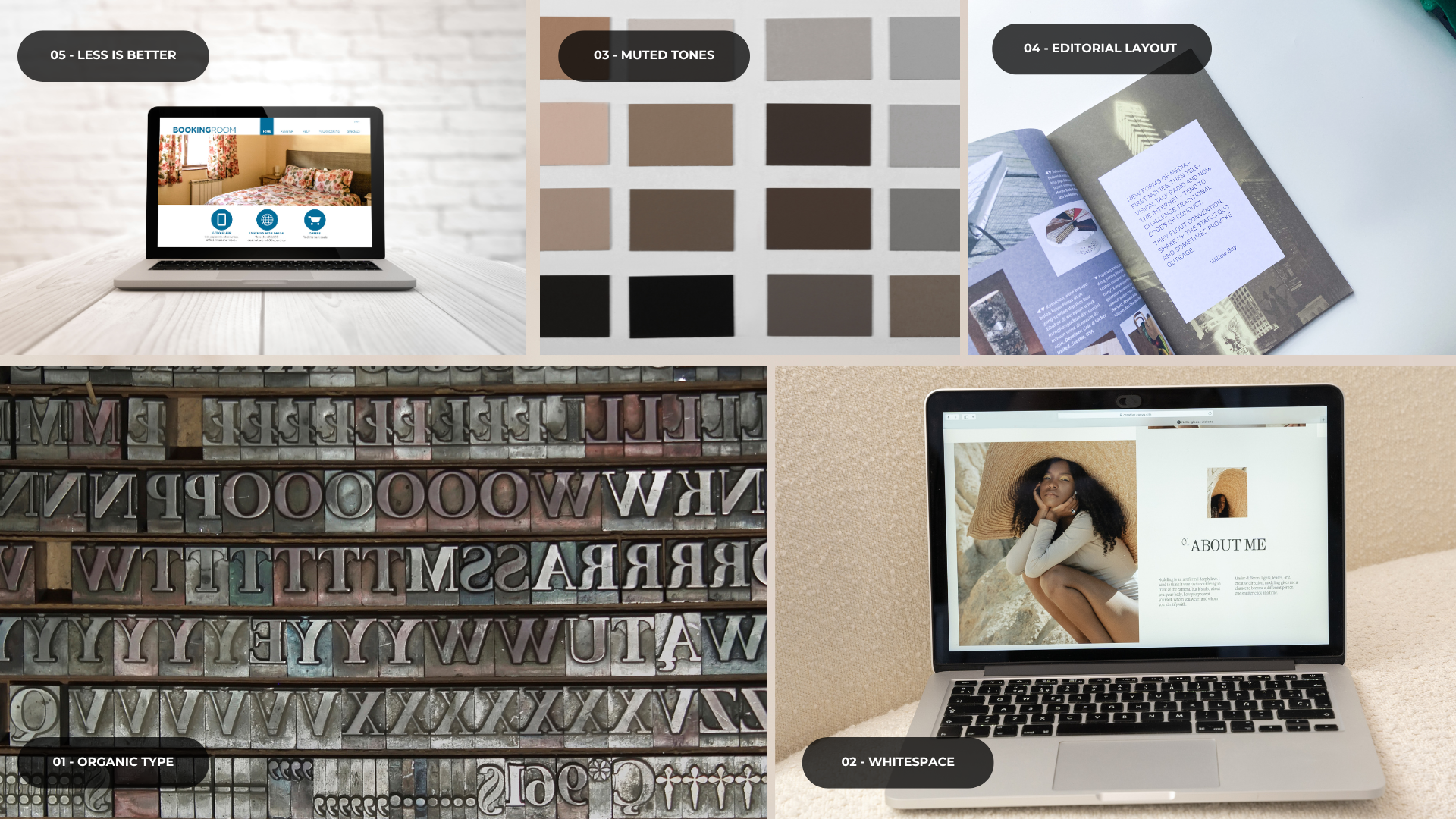
5 trends your wellness or coaching brand should be paying attention to right now.
— THE FIVE TRENDS —
The five wellness brand design trendsworth paying attention to
These trends are not passing fads. They each reflect a deeper shift in what wellness clients are responding to emotionally and what brands are doing to meet that shift. Understanding why each one is resonating gives you something more useful than a style guide. It gives you a framework for making design decisions that feel true to your practice and your client at the same time.
For the last decade clean geometric sans serifs dominated wellness branding. Circular. Futura. Proxima Nova. Everything felt sharp, modern, and slightly corporate. That wave is turning. The brands that are standing out right now are the ones using serif fonts with character. Typefaces that feel like they were drawn by a human hand rather than plotted by an algorithm.
Think of the difference between a typed label and a handwritten one. The handwritten one communicates care, specificity, and presence. Organic serifs do the same thing digitally. They suggest that someone made considered choices rather than just defaulting to whatever font came with the website template. They signal humanity in a space that is increasingly algorithmic.
This shift is also connected to a broader cultural movement toward craft and intentionality. Wellness clients in particular are drawn to brands that feel made rather than manufactured. A well chosen serif headline communicates that feeling before a single word has been read.
Whitespace is not just a design principle anymore. It is actively becoming a competitive differentiator in the wellness and coaching space. The brands that look most premium right now are the ones giving their content room to breathe. Tall padding around sections. Wide margins on either side of text. Generous line height. Space between the headline and the body copy that lets both land properly before the eye moves on.
This is a trend because most small business websites are still cluttered. The contrast between a site that uses space well and one that does not has never been more visible. A visitor who lands on a generously spaced wellness website feels something shift before they have read a word. That feeling is what whitespace is doing. It is communicating calm, intention, and confidence without a single line of copy.
Because so few small brands have figured this out yet the window to differentiate with whitespace is still wide open. In a sea of cluttered wellness websites a site that breathes immediately looks more expensive and more trustworthy than its competitors regardless of how much either brand spent on design.
Stark white backgrounds and pure black text are giving way to something warmer and more alive. Warm off whites. Dusty rose. Muted sage. Clay. Warm stone. The kind of colors that feel like they exist in the physical world, like something you could touch. These tones are resonating so strongly in wellness and coaching branding because they feel safe and grounded. They communicate that the person behind the brand is real and considered rather than clinical or corporate.
The key distinction is muted. These are not pastel versions of primary colors. They are colors that have been mixed with grey or brown to give them weight and warmth. Dusty rose rather than hot pink. Warm sage rather than bright green. Stone rather than stark beige. The muting is what gives them their premium quality. They feel like natural pigments rather than synthetic dyes.
These tones also photograph beautifully and tend to age exceptionally well. A brand built on muted earth tones right now will still feel considered and relevant in several years. That longevity makes them a particularly strong investment for wellness brands who want to build something lasting rather than constantly refreshing.
Wellness and coaching websites are starting to look less like websites and more like the inside pages of a carefully designed magazine. Asymmetric layouts where the image bleeds to one edge while the text sits in a generous column on the other. Large pull quotes given their own full width moment. Section numbers in oversized serif numerals used as visual anchors. Eyebrow labels in small uppercase tracking that organise content the way a magazine article does.
This is happening because people are tired of every website looking the same. The standard hero, three column feature grid, testimonial, CTA format is so familiar that people scan through it without reading. Editorial layouts break that pattern. They slow the reader down and create a sense that someone has thought carefully about how information should be experienced rather than just displayed.
The brands adopting this aesthetic are borrowing from publications like Kinfolk, Cereal, and Monocle. Print magazines known for using layout as an expressive tool rather than just a container for content. These publications treat the page as something to be experienced not just read and the best wellness websites are starting to do the same thing.
This is the trend that underlies all the others. After years of maximalism in small business branding, more sections, more badges, more social proof widgets, more pop-ups, more everything, there is a clear and accelerating shift toward restraint. The brands that are building real trust right now are the ones that are not trying to convince you of anything. They make one clear offer. They use one clear visual language. They ask for one clear action.
This shift is partly a reaction to information overload. Wellness clients especially are coming to your brand specifically because they are overwhelmed. A website that adds to that overwhelm rather than relieving it is working against the promise your practice is making. The most trusted wellness brands right now are the ones whose websites feel like a deep breath. Immediate, calm, and clear about what they offer.
This is harder than it sounds. Adding things is easy. Removing things requires conviction. It requires trusting that what you have is enough. But clarity converts. Clutter does not. The brands that have made peace with saying less are consistently the ones that convert visitors into clients more reliably than the ones who say everything.
“The brands leading right now are not the ones chasing trends. They are the ones choosing one or two directions that are true to who they are and executing them with conviction.”
— THE BIGGER PICTURE —
What all five trends have in common
What strikes me about all five of these trends is that they are all asking the same question in different ways. What does it feel like to be trusted before a single word is read? What does a brand look like when it is confident enough to say less?
The answer across typography, whitespace, color, layout, and content is always the same. It looks intentional. It looks edited. It looks like someone made choices rather than just filling space.
You do not need to adopt all five of these trends. You do not need to adopt any of them if they do not fit who you are. But understanding what is resonating right now and why gives you something more useful than a trend report. It gives you a clearer picture of what your audience is responding to emotionally. And that is worth paying attention to regardless of what is in fashion.
The most powerful version of any of these trends is the one that feels completely natural for your specific practice and your specific client. A muted earth tone palette that does not match the feeling of your work will always feel like a costume. The same palette chosen because it genuinely reflects how your client needs to feel before she books will feel inevitable. That is the difference between following a trend and understanding one.
The Eranova Design template collection is built on every one of these principles. Organic typography, generous whitespace, muted palettes, editorial layouts, and confident restraint.
Browse the templates