Studio Window No. 03
The most powerful design tool you are not using
ELYSA - ERANOVA DESIGN MAY 4 2026 12 MIN READ
It does not cost anything. It requires no software. And most wellness brands are afraid of it. It is called whitespace and it might be the single most misunderstood concept in design.
I want to be honest about something before we get into this. I am writing this post because I am learning about whitespace at the same time as I am teaching it. The more I design the more I realise how much of good design is about what you leave out rather than what you put in. Whitespace is where I keep coming back to that lesson.
So this is not me talking down from some design authority position. This is me thinking out loud about something that genuinely changed how I approach every layout I build. I hope it does the same for you.
This post covers what whitespace actually is, why most wellness websites get it wrong, why it matters specifically for wellness brands, and three specific places you can start using it today without redesigning your whole website.
— WHAT WHITE SPACE ACTUALLY IS —
What whitespace actually is in web and brand design
First thing to know: whitespace does not mean white. It means empty. It is the space between and around design elements. The gap between your headline and your body copy. The padding around a button. The margin between sections on your website. The breathing room around your logo on a business card.
It can be any color. The quiet cream background on a wellness site is whitespace. The generous gap between two paragraphs is whitespace. The deliberate emptiness in the left half of a hero section is whitespace. It is not nothing. It is a design choice. And like every design choice it is communicating something whether you intend it to or not.
Designers often divide whitespace into two categories. Macro whitespace is the large scale space between major sections and layout elements. The gap between your navigation and your hero section. The padding on either side of your content column. The space between your services section and your testimonials. Micro whitespace is the smaller scale space between individual elements. The leading between lines of text. The space between a label and its content. The padding inside a button.
Both matter. But micro whitespace is often where wellness brand websites fall apart first because it is the smallest decisions that are hardest to see until you have some distance from your own work.
“Whitespace is not the absence of design. It is design doing its quietest and most important work.”
The reason most people avoid whitespace is that empty space feels like wasted space. Especially when you have a lot to say about your business. You want people to know about your yoga classes and your sound healing sessions and your weekend retreats and your new membership offer. So you put it all on the page. And then nobody reads any of it.
That is the paradox at the heart of whitespace. The more you try to say the less gets heard. And the more space you give your content to breathe the more clearly each individual thing communicates. Less is genuinely more. Not as a cliche but as a measurable design reality.
— WHAT HAPPENS TO A WELLNESS WEBSITE WITHOUT WHITESPACE —
What a wellness website looks like without whitespace
Look at the comparison image below. Same brand. Same content. Same fonts and colors. The only real difference is how much space each version gives itself.
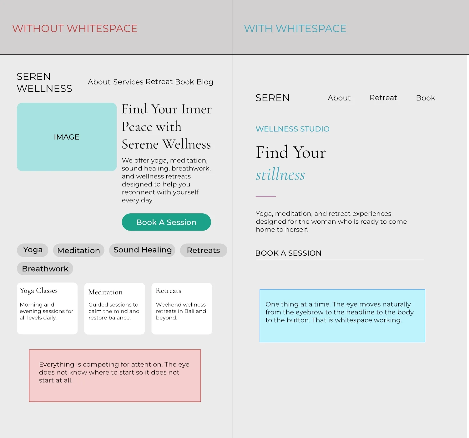
Two versions of the same wellness brand hero section. One without whitespace, one with. The difference is not what is there. It is what is not.
The left version is not wrong. Every single element on it is useful information. But it is exhausting to look at. Your eye does not know where to go first. Everything is competing for attention with equal weight and equal urgency. The result is that nothing actually gets read because nothing stands out enough to earn a first glance.
The right version says less and communicates more. That is the paradox of whitespace and once you see it you cannot unsee it. The headline has room to land. The body copy has room to be read. The button has room to feel like an invitation rather than a demand. The whole page feels more trustworthy and more considered without a single word having changed.
Why cluttered design loses clients before they read a word
There is research behind this. The Nielsen Norman Group, one of the most respected user experience research organisations in the world, has documented extensively that visual complexity is one of the primary reasons users leave websites quickly. When a page is visually overwhelming the brain registers it as effortful before any conscious reading has happened. That effort feeling is enough to trigger a click away.
For wellness brands specifically this is even more damaging because the first impression your website makes should be one of calm, clarity, and intention. A cluttered wellness website is not just aesthetically underwhelming. It is actively contradicting the promise your brand is making about the experience of working with you.
— WHY WHITESPACE MATTERS SPECIFICALLY FOR WELLNESS BRANDS —
Why whitespace matters more for wellness brands than almost any other industry
There is something specific about the wellness space that makes whitespace especially important and it comes back to the promise your brand is making.
Your wellness brand is promising calm, intention, and presence before a single word is read. It is promising that the experience of working with you will be thoughtful, unhurried, and considered. That promise begins the moment someone lands on your website. And if your website feels cluttered and overwhelming you are breaking that promise before the conversation has even started.
Think about the physical spaces you associate with wellness. A yoga studio with bare wooden floors, natural light, and a few plants. A spa reception with a single orchid on a white counter and soft music. A meditation app with a plain background and one slow breathing animation. The emptiness in all of those spaces is not an accident and it is not a budget decision. It is intentional. It is doing the work of putting you in the right state of mind before the experience begins.
Your website should do the same thing. The moment someone lands on your page they should feel something shift before they have read a single headline. That shift is created by space, by light, by breathing room. Whitespace is how you create that feeling digitally. And when you get it right your website becomes an extension of your practice rather than just a place where information lives.
The brands in the wellness space that feel premium, considered, and worth the investment almost always have one thing in common. They are not afraid of empty space. They trust that what they have is enough and they give it room to prove that rather than filling every corner to compensate for doubt.
— THREE PLACES TO START USING WHITESPACE TODAY —
Three places to start using whitespace on your wellness website today
You do not have to redesign your whole website to start using whitespace better. These three changes can be made in an afternoon and each one will make an immediate visible difference to how your brand feels.
“The brands that look expensive are usually just the ones that are not afraid of empty space.”
Most websites have this set to a default margin that is too small. The headline arrives and the body copy immediately follows without giving the headline a moment to land. Double whatever spacing you currently have between your headline and your first paragraph. The headline needs room to breathe before the supporting copy begins. That extra space is not empty. It is giving your most important line of text the weight it deserves.
A button with generous padding feels premium. A button with tight padding looks like a form field. This is one of the smallest changes you can make and one of the most immediately noticeable. Go to your primary call to action button right now and increase the top and bottom padding by at least 50 percent. You do not need to change the color, the font, or the border radius. Just give it more room inside and watch how much more intentional it looks.
If your text runs edge to edge on a page it is exhausting to read. The eye has no resting point and no sense of where the content ends and the interface begins. Pull your content inward. A narrower content column with generous margins on either side is easier to read, looks more considered, and gives your page a sense of editorial intentionality that full width content almost never achieves. Most professional wellness websites cap their content width at 680 to 720 pixels even on large screens.
That is the thing I keep coming back to as I build templates. The difference between a design that feels premium and one that does not is almost never about the fonts or the colors. It is about confidence. And whitespace is confidence made visible. It is a brand saying I trust that what I have here is enough. I do not need to fill every corner to earn your attention.
Your wellness brand has enough. Give it room to breathe.
— WHITESPACE AS CONFIDENCE —
Whitespace is confidence made visible
That is the thing I keep coming back to as I build templates. The difference between a design that feels premium and one that does not is almost never about the fonts or the colors. It is about confidence. And whitespace is confidence made visible.
A brand that uses generous whitespace is saying something without words. It is saying I trust that what I have here is enough. I do not need to fill every corner to earn your attention. I do not need to tell you everything at once to convince you to stay. What is here is worth your time and I am giving it room to prove that.
That message is especially powerful in the wellness space where your client is often coming to you precisely because she is overwhelmed. She does not need more information competing for her attention. She needs a space that feels considered and calm. A space that communicates that you understand what it is like to need things to slow down. Your website can be that space before she has ever met you.
Your wellness brand has enough. Give it room to breathe.
Every Eranova Design template is built with whitespace at the center of every layout decision. Browse the collection and see what considered space looks like in practice.
Browse the templates