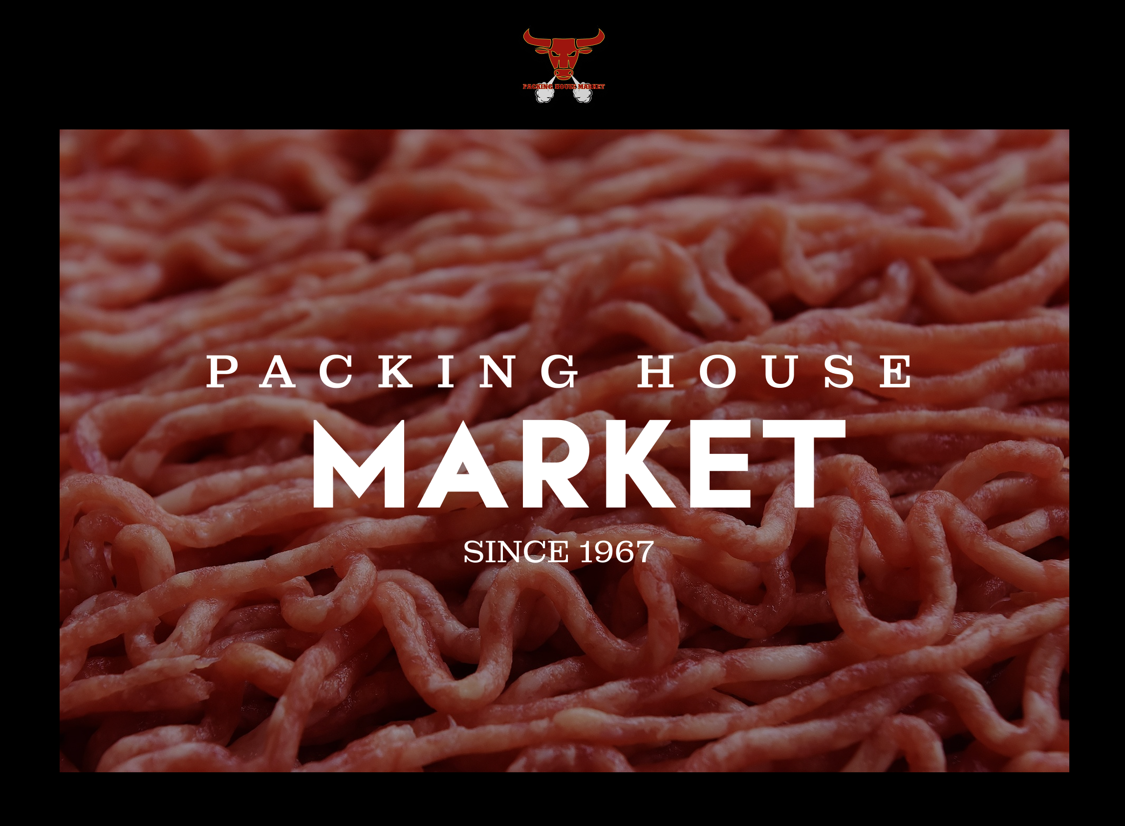
Packing House Market
Complete Website Redesign for Local Grocery Shop
Complete website redesign for family owned Dallas grocery and butcher shop. Includes 8+ pages: homepage, product category pages, about, contact, and custom error pages. Modern design with high quality food photography, intuitive navigation, and full responsive layouts. Delivered as comprehensive Figma file with design system.
Project Overview
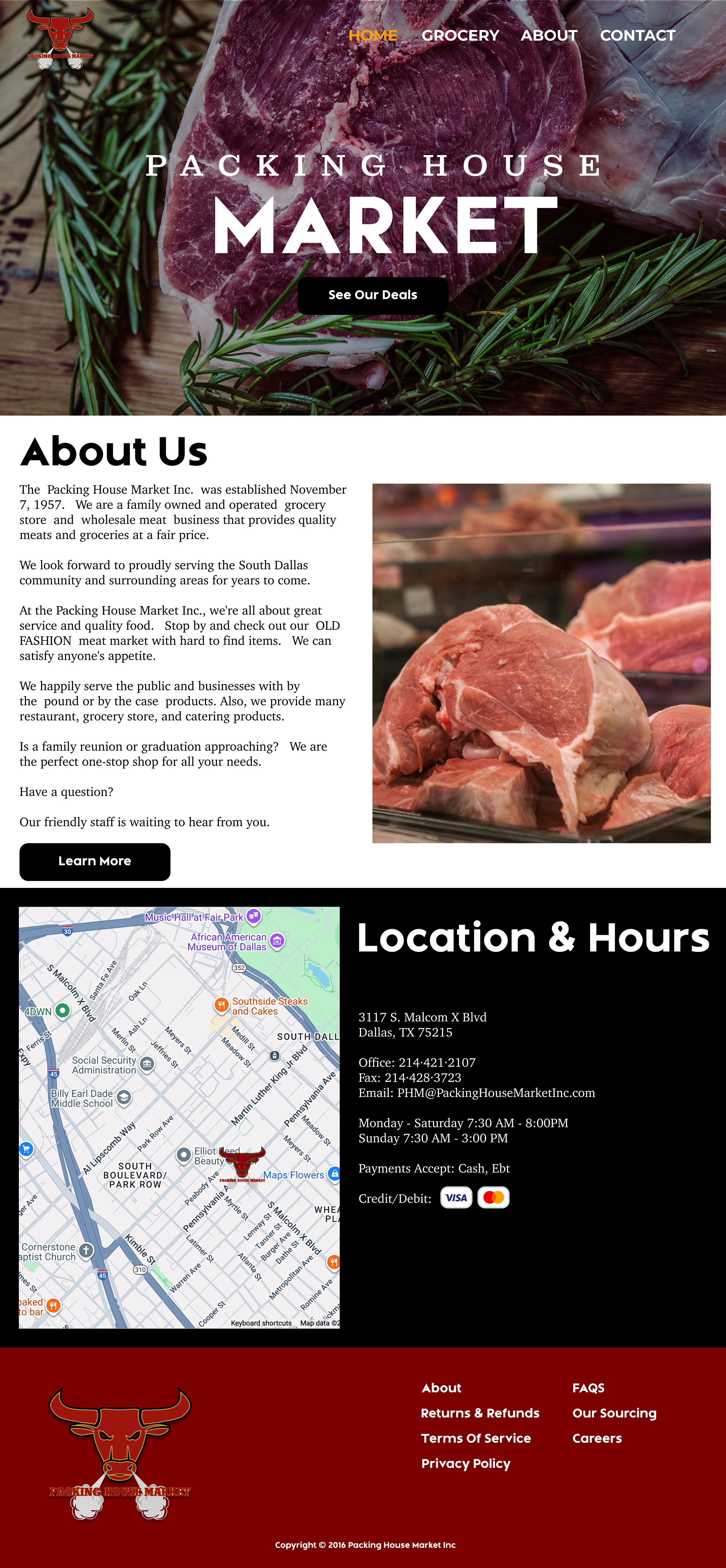
The Challenge: Original website was overwhelmed with unformatted text, lacked visual hierarchy, had poor navigation structure, and didn't showcase their premium products effectively. Customers struggled to find basic information like hours and location.
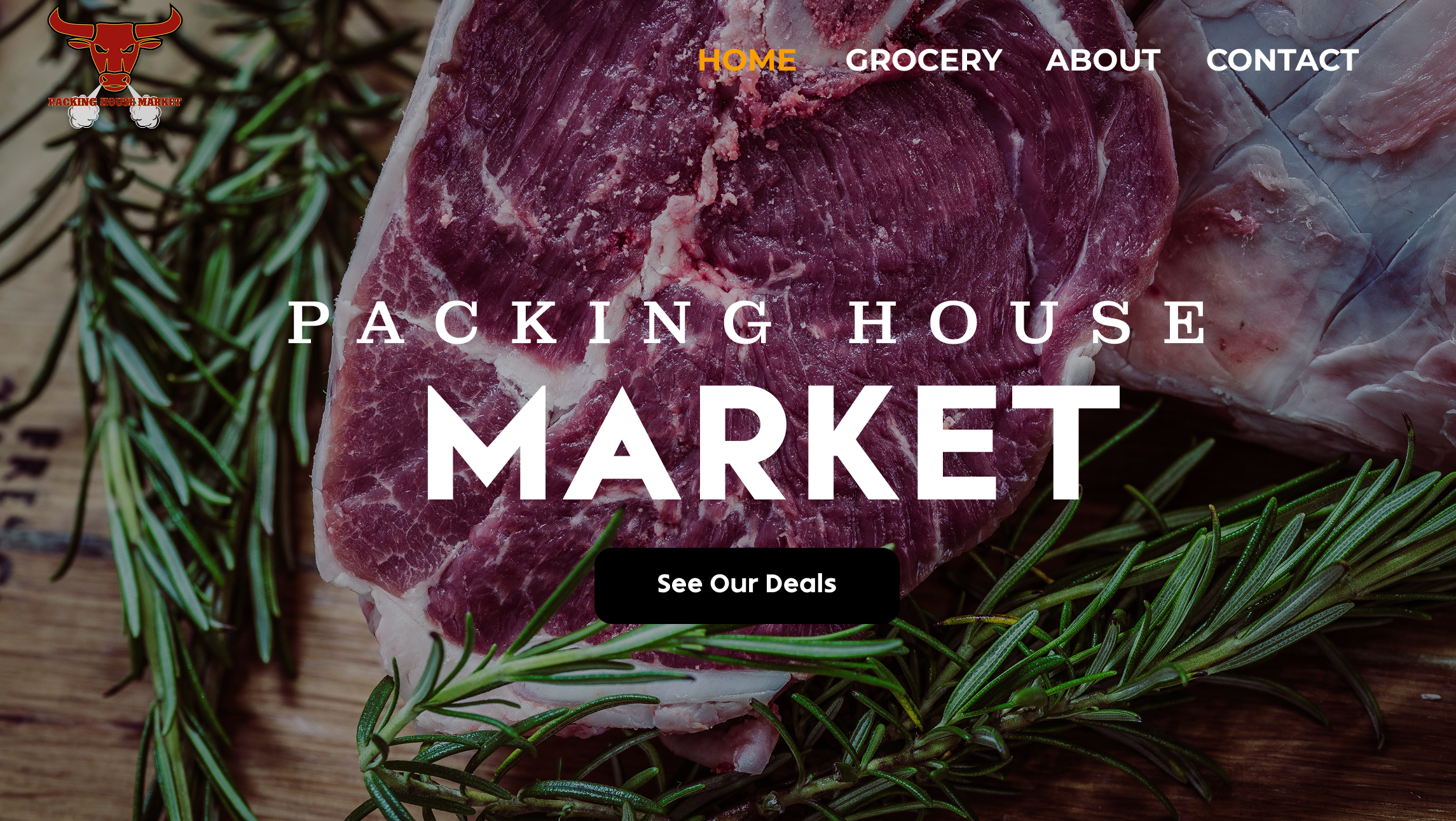
The Solution: Complete 8-page redesign with clean, modern aesthetic. Reorganized content with clear information architecture, introduced high-quality product photography, established consistent typography and spacing, and created intuitive navigation. Designed fully responsive layouts for seamless mobile experience.
The Result: Professional website that positions Packing House Market competitively while honoring their heritage. Delivered as developer-ready Figma file with complete design system
User-Centered Design for Local BusinessMy Approach
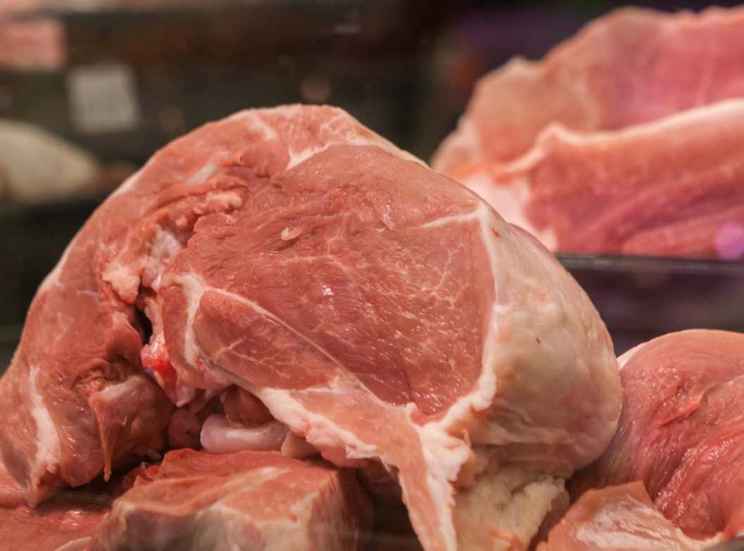
Rather than abandoning the business's 60-year history, I designed with respect for their legacy while modernizing the visual language. The warm color palette and authentic food photography communicate quality and tradition, positioning Packing House Market as both established and current.
Honor Heritage
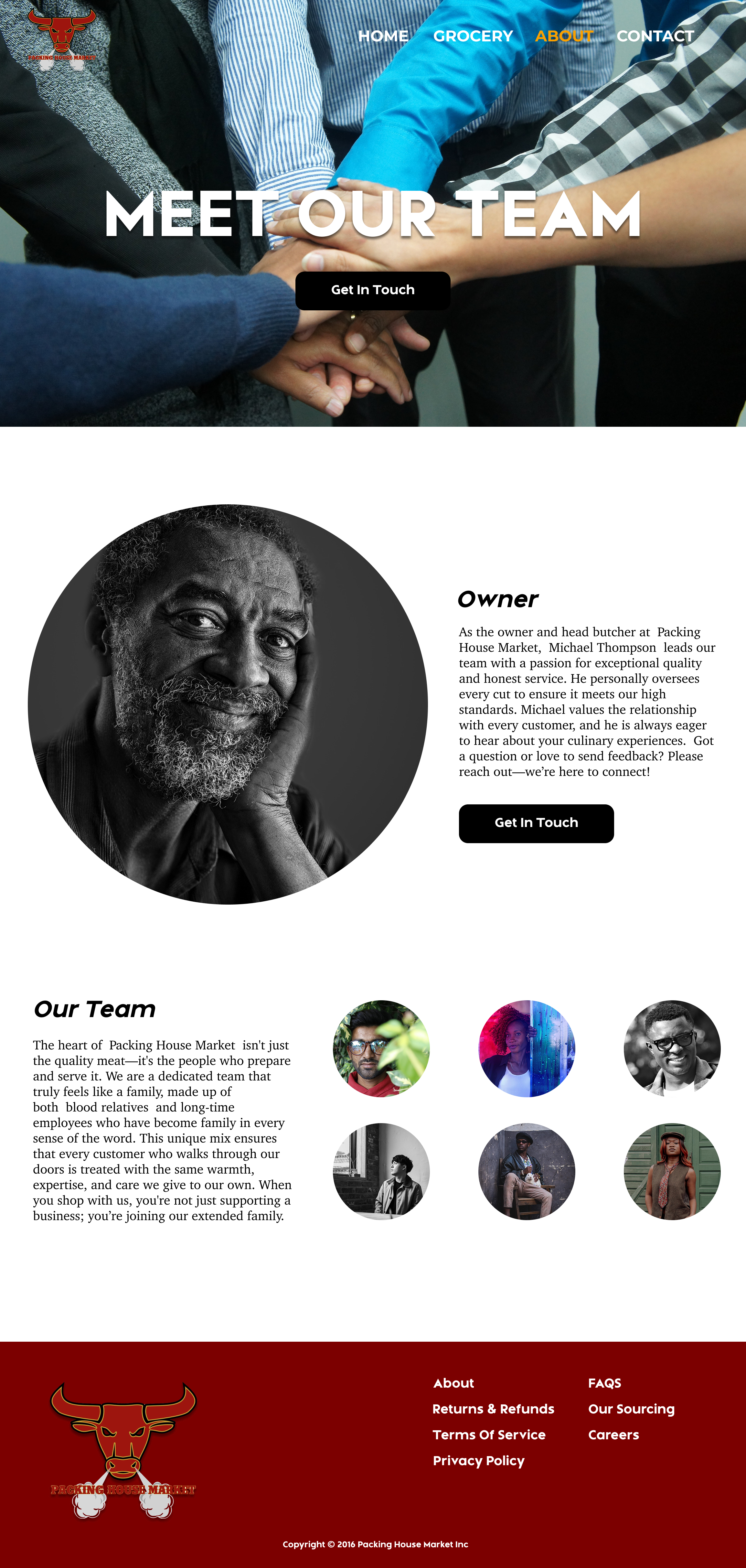
The design establishes credibility through professional execution: high-quality product photography showcases their premium meats and groceries, the About page highlights their team and family story, and consistent branding throughout creates a cohesive, trustworthy impression.
Build Trust
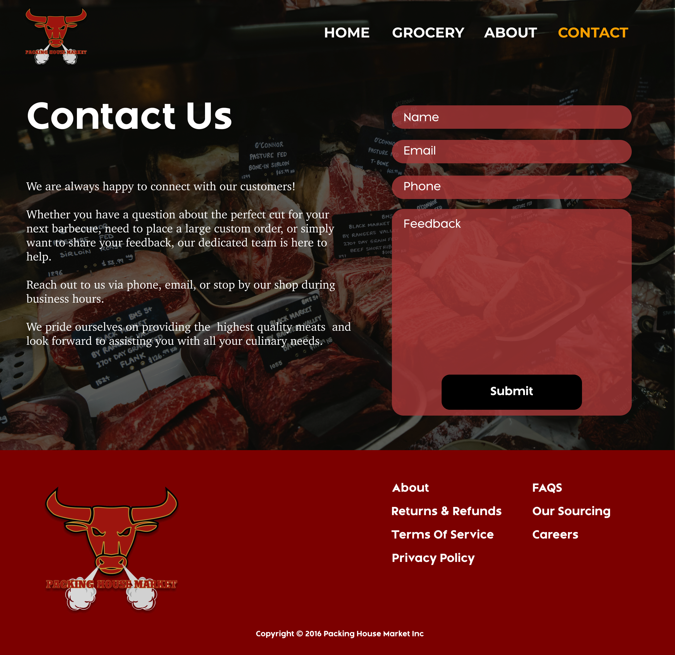
I used clean typography, generous white space, and intuitive navigation to ensure customers could quickly find products, contact information, and business hours. Every design decision served the goal of making the shopping experience effortless.
Prioritize Function
Product categories are clearly defined with visual cards and descriptive photography. The navigation structure guides users logically from discovery to contact, while the design system ensures consistency across all 8 pages without overwhelming visitors.
Organize Information
Design Decisions
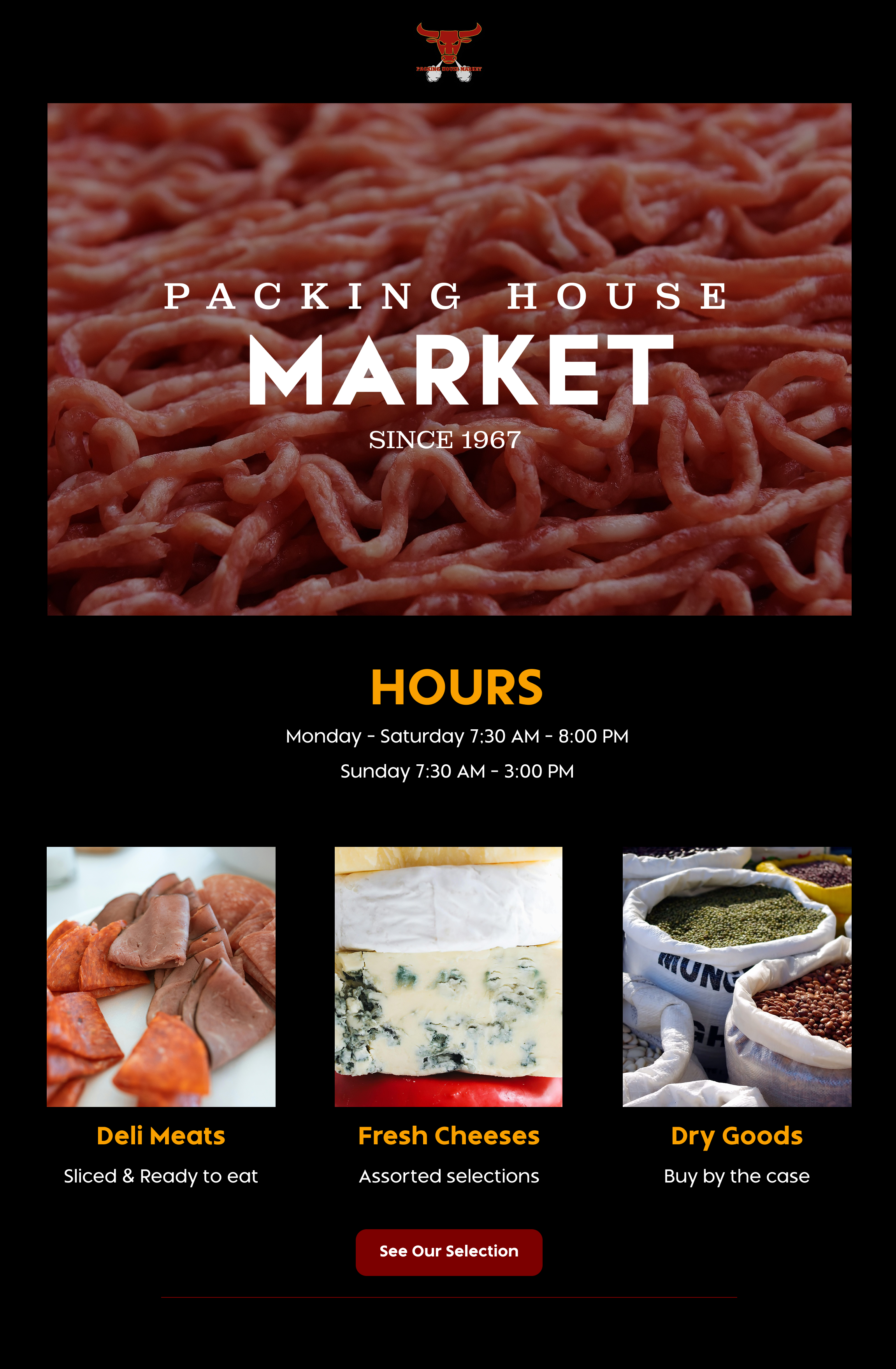
Deep Red + Gold + Neutral Color Palette
1
Selected a warm, heritage-focused color system grounded in Deep Red (#8B0000) for strength and tradition, complemented by Gold (#F4B41A) for premium positioning and warmth, and clean Neutrals (whites and grays) for balance and readability. This palette reflects Packing House Market's 60-year legacy, quality meat products, and family-owned authenticity while maintaining strong contrast for accessibility. The combination feels established yet welcoming, avoiding the sterile feel of corporate grocery chains.
Clear Navigation Structure
2
Implemented straightforward top navigation organized by product type: Meat Products, Bulk/Dry Goods, Cleaning Products, and Grocery/Beverage. This predictable structure allows customers to find what they need immediately, whether shopping for a specific item or browsing categories. The navigation remains consistent across all pages, with clear active states showing current location, reducing cognitive load and building user confidence.
Design System & Components
3
Built reusable components (navigation bar, product category cards, contact forms, footer structure, hero sections) with defined variants rather than designing each instance uniquely. This approach ensures consistency across all 8+ pages, speeds up potential future development, and demonstrates scalability. If Packing House Market adds new product categories or pages, the system adapts seamlessly without requiring completely new designs.
Visual Hierarchy for Scan-ability
4
Used consistent typography scales, generous white space, and clear content sections to guide users through information efficiently. Large, bold headings establish page purpose immediately, product categories are displayed as scannable cards with imagery, and business hours/contact information are prominent on every page. These elements reduce friction by setting clear expectations and providing constant reassurance that users can find what they need.