Econique
E-commerce Web Designing
Designed and prototyped a comprehensive e-commerce platform for a sustainable athletic wear brand, demonstrating end-to-end user experience thinking across the complete purchase journey. The redesign showcases modern e-commerce best practices, including intuitive product discovery, streamlined checkout flows, and strategic information architecture.
The ChallengeThoughtful Design in Progress
Design a complete e-commerce platform for Econique, a fictional women's athletic wear brand emphasizing sustainability and inclusivity. The project required designing 9 distinct pages across marketing, transactional, and informational contexts while maintaining strict design system consistency. Key challenges included creating an intuitive product discovery experience with effective filtering, designing a frictionless checkout flow, and establishing clear information hierarchy across product pages, shopping cart, and order confirmation screens.
The complexity lay in balancing multiple competing priorities: accommodating extended sizing options without cluttering product cards, presenting detailed product specifications without overwhelming users, and guiding customers through a multi-step checkout while maintaining brand voice and trust. Additionally, I needed to establish a reusable component library with consistent spacing, typography, and color usage across all pages on a 1280px canvas with an 8px grid system.
Rather than treating each page in isolation, I approached the entire flow as a connected ecosystem, ensuring navigation patterns, button styles, form fields, and messaging remained consistent throughout the user journey. The focus was on demonstrating thoughtful design decisions around spacing, typography hierarchy, and interaction states, demonstrating that strong UX stems from systematic thinking, not just visual aesthetics.
My ApproachConsistency
Before designing any pages, I established a comprehensive design system including a cohesive color palette (Navy #343140, Teal #8D9FA6, Mint #CEF2DE, Grays, Off-white), typography hierarchy, spacing grid (8px), and reusable component variants. This system served as the foundation for all subsequent design decisions, ensuring consistency across the 9-page platform and reducing design iterations.
Design System First
Information Architecture & Hierarchy
For each page, I prioritized content based on user goals: product pages emphasized imagery and purchasing options, checkout minimized form fields through smart defaults (same billing address), and order confirmation reduced post-purchase anxiety through clear timelines. Typography, spacing, and color were used strategically to guide attention to critical elements.
I mapped the complete customer journey from discovery to post-purchase, identifying key decision points and pain points at each stage: browsing (Footwear page), product evaluation (Product page), cart review, checkout, and confirmation. This approach allowed me to design with intention—each page solved a specific problem in the larger flow rather than existing in isolation.
User Journey Mapping
Throughout the design process, I continuously audited pages against the design system, ensuring button styles, form states, spacing, and navigation remained consistent. This systematic approach meant that refinements to one component automatically improved the entire system, rather than creating inconsistencies across pages.
Refinement & Consistency Checks
Design Decisions
Navy + Teal + Mint Color Palette
1
Selected a modern, sustainable-forward color system grounded in Navy (#343140) for trust and professionalism, complemented by Teal (#8D9FA6) for approachability and Mint (#CEF2DE) for action-oriented CTAs. This palette reflects Econique's core values, sustainability, inclusivity, and quality, while maintaining strong contrast for accessibility. The combination feels premium yet welcoming, avoiding the clinical feel of many athletic wear brands.
Layout Consistency
2
Implemented consistent left-right layouts across Cart, Checkout, and Product pages: product information/forms on the left, order summary or key actions on the right. This predictable structure reduces cognitive load, allows users to quickly scan critical information (pricing, totals), and keeps conversion-focused elements (CTAs) in constant view through sticky positioning.
Component Library
3
Built reusable components (product cards, form fields, buttons, quantity selectors, size grids) with defined variants rather than designing each instance uniquely. This approach ensures consistency across all 9 pages, speeds up design iteration, and demonstrates scalability, if Econique adds new product categories or pages, the system adapts seamlessly.
Clear Information Hierarchy
4
Used visual progress markers (Cart → Shipping → Payment), order summaries on every transactional page, and consistent typography hierarchy to guide users through the purchase journey. These elements reduce anxiety by setting expectations and providing constant reassurance that the system is working as intended.
Design Breakdown

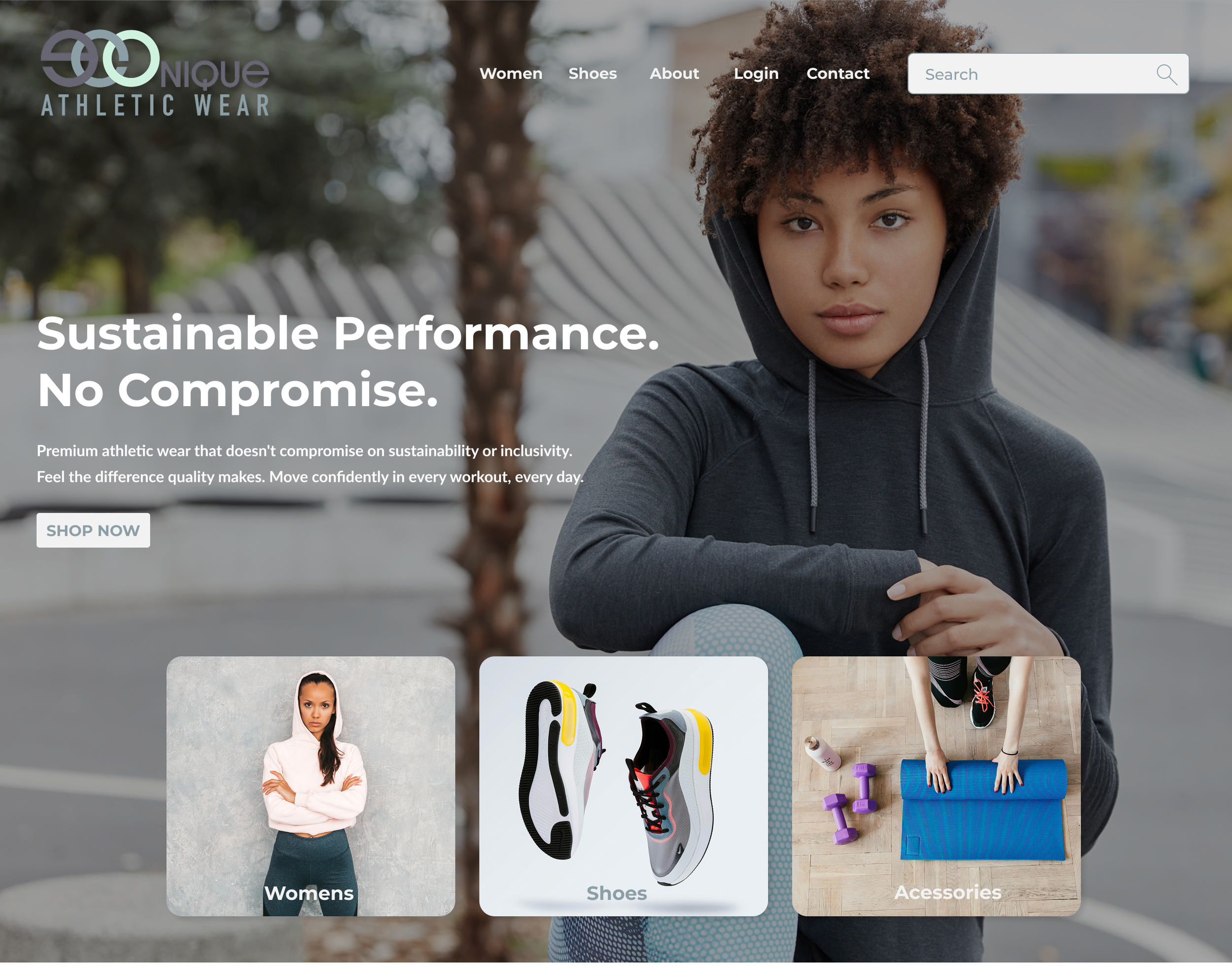
Home Page
The entry point establishes brand identity and guides users toward products. Features a hero section with lifestyle imagery, "Best Sellers" product grid showcasing top items, brand value pillars (Sustainability, Inclusivity, Quality), and customer testimonials to build credibility. Navigation is clear and prominent, with size/fit category options (Plus, Petite, Standard) visible from the start to signal inclusivity.
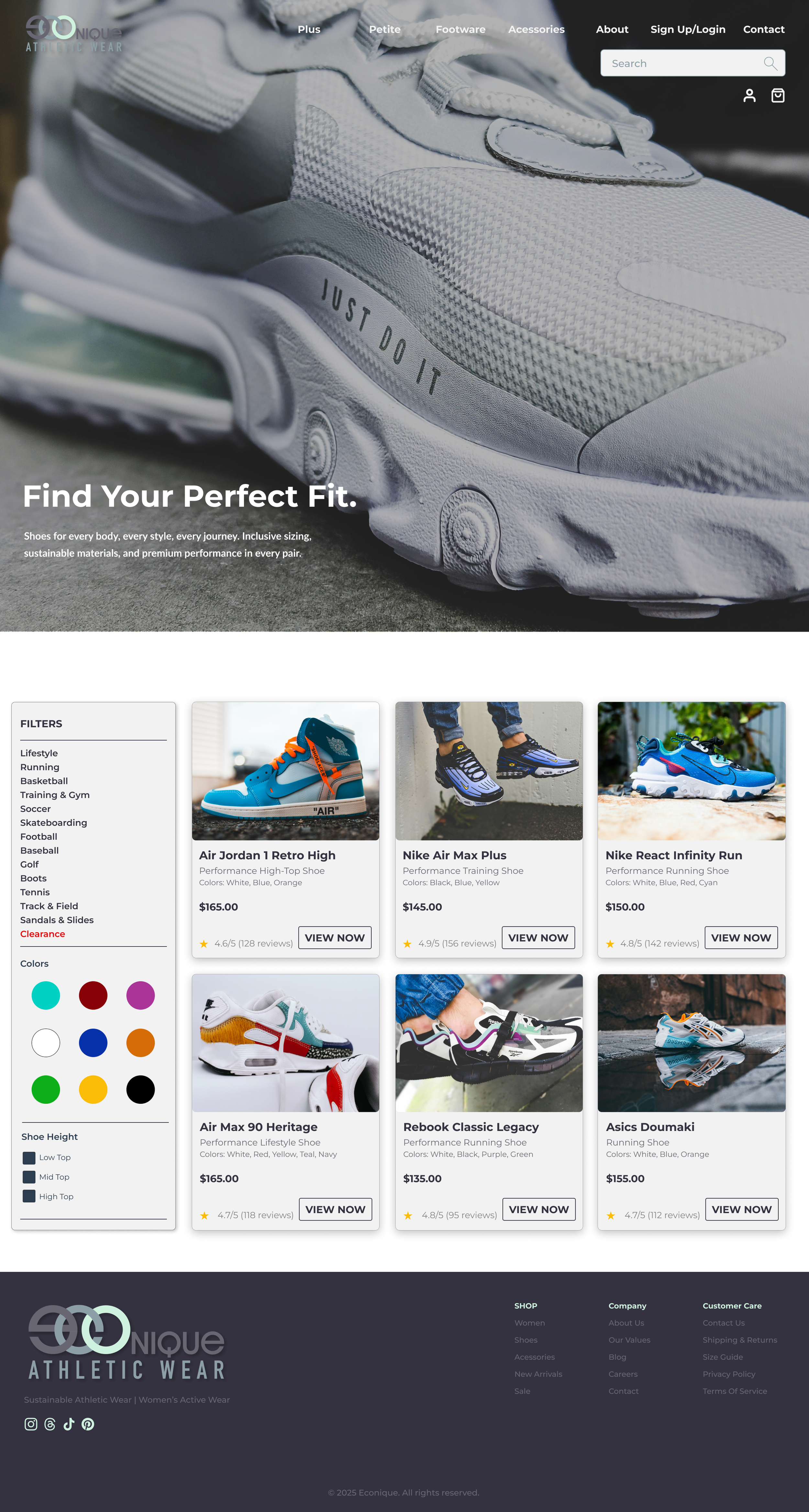
Footwear Page
A category-specific browsing experience with hero messaging ("Find Your Perfect Fit"), left-sidebar filtering (Lifestyle, Running, Basketball, etc.), color swatches, and shoe height options. The 3-column product grid displays consistent cards with product image, name, descriptor, price, rating, and "VIEW NOW" CTA. This page solves the product discovery problem—helping users narrow from hundreds of options to their ideal shoe.
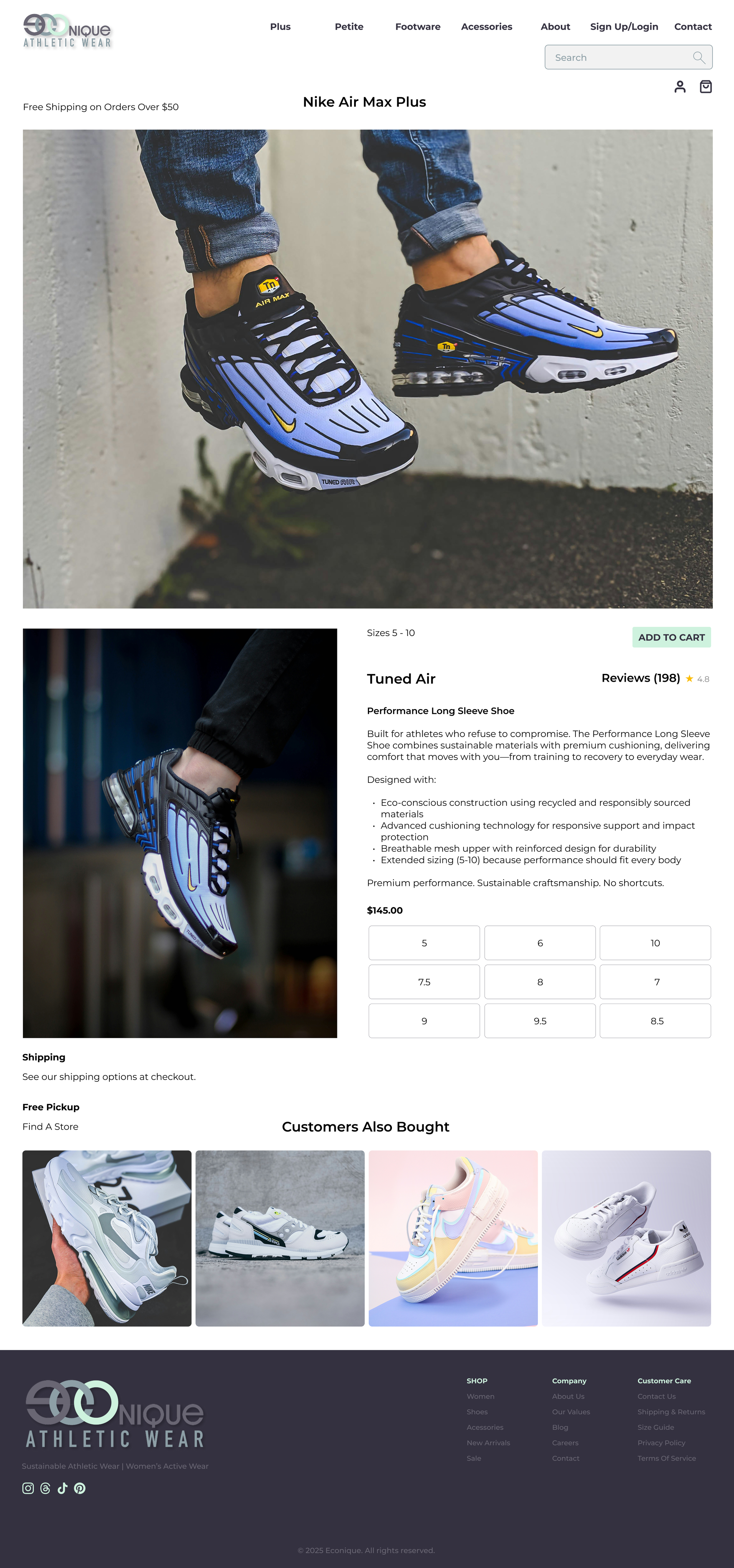
Product Detail Page
Deep-dive into a single product with large hero images, size selector grid, color options, detailed description emphasizing eco-friendly materials, pricing, reviews section with star ratings, and "Customers Also Bought" carousel. The layout prioritizes product imagery and purchasing options while providing the context needed for confident buying decisions.
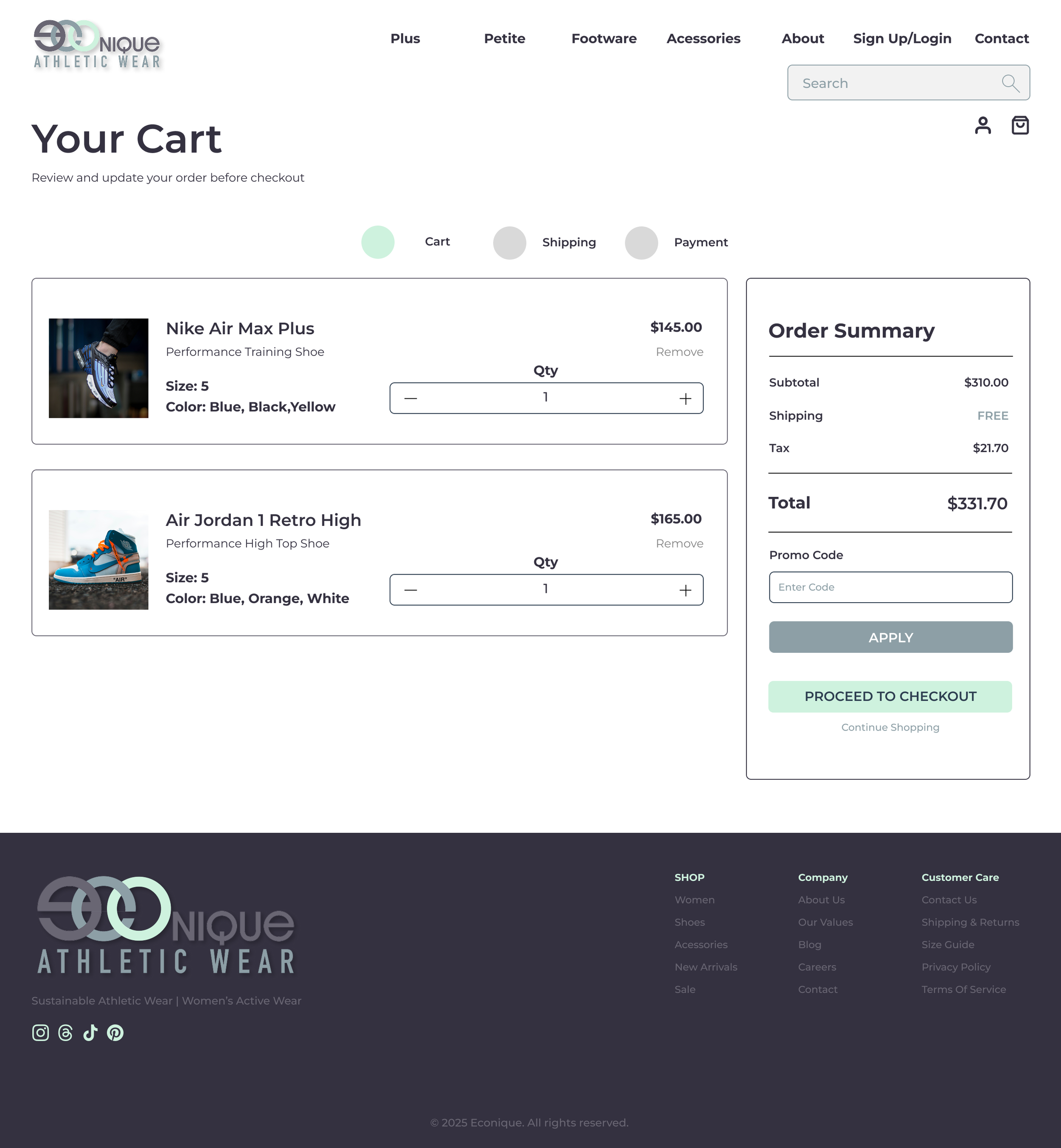
Shopping Cart
Two-column layout: left side shows line items with product image, details (size, color), quantity selector with +/− buttons, price, and remove link. Right sidebar displays order summary (Subtotal, Shipping, Tax, Total), promo code input, and "PROCEED TO CHECKOUT" CTA. This page lets users review and adjust orders before committing, reducing cart abandonment.
Checkout
Multi-section form spanning Shipping Information, Billing Information, Shipping Method selection, and Payment Information. Progress indicator shows Cart ✓, Shipping (current), Payment (upcoming). Right sidebar maintains sticky order summary so users never lose sight of what they're purchasing. Form design uses clear labels, logical grouping, and required field indicators.
Order Confirmation
Celebratory success page with checkmark icon, order number, itemized order details, shipping address, estimated delivery date, order total, and "What's Next?" timeline (Order Confirmation → Processing → On the Way → Delivered). Dual CTAs: "Continue Shopping" drives repeat purchases; "View My Orders" builds account engagement.
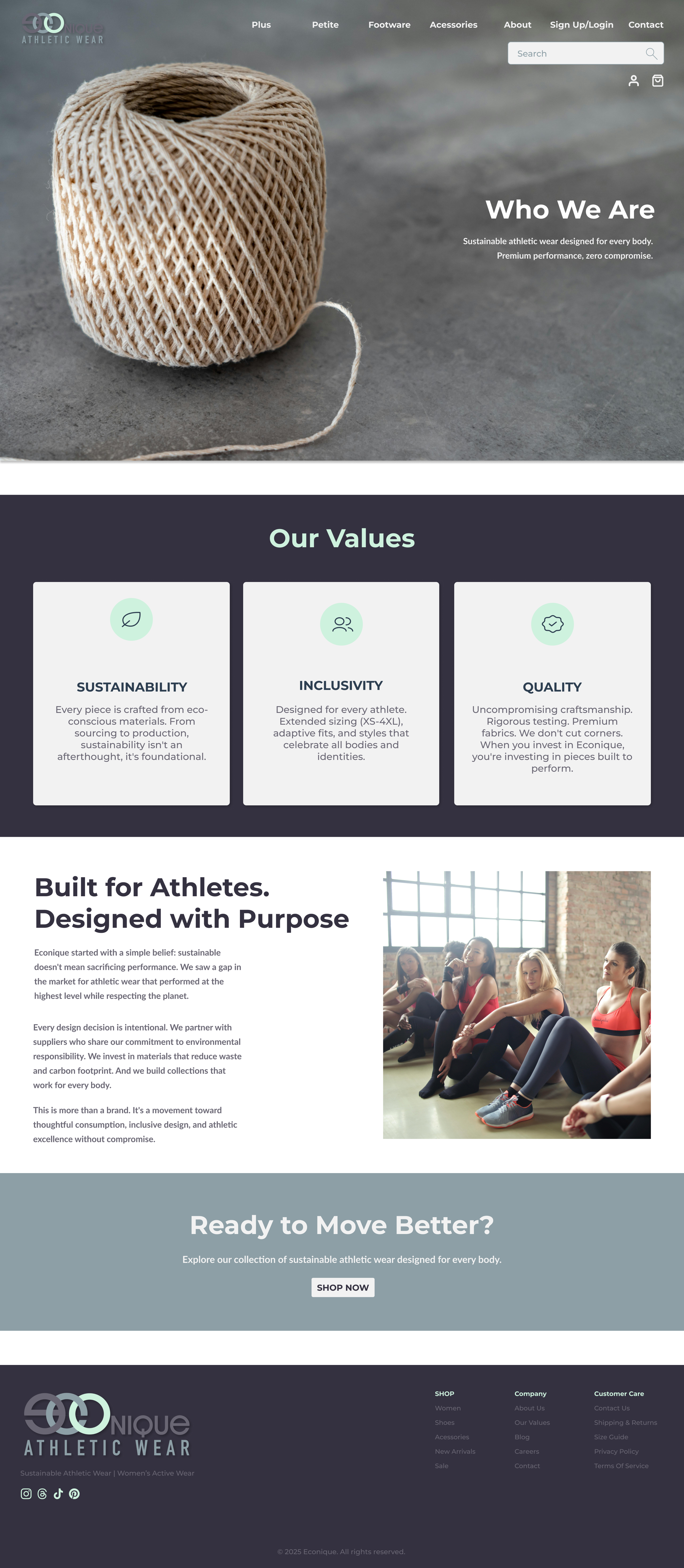
About Page
Brand storytelling section featuring hero with brand promise, "Our Values" three-column cards (Sustainability, Inclusivity, Quality), two-column "Built for Athletes, Designed with Purpose" narrative with lifestyle imagery, and CTA section ("Ready to Move Better?") that bridges storytelling to shopping.
Contact Page
Lead generation page with contact form (Name, Email, Message) overlaid on hero imagery, "Location & Hours" section with embedded map, business hours, and store address. Includes shipping and pickup information to support customer service needs.
Error Page
404 error state with friendly messaging, error icon, and CTAs to return home or browse products. Maintains brand consistency while helping lost users find their way back.
Results & Impact
This portfolio project demonstrates a complete, production-ready e-commerce design system. While a mockup, it was built with real-world metrics in mind: optimizing for conversion funnel performance (product discovery → add to cart → checkout completion), reducing cart abandonment through transparent order summaries and progress indicators, and building customer confidence through clear shipping timelines and order confirmation. The systematic approach to components, spacing, and typography creates a foundation that scales—additional products, categories, or pages would maintain consistency without additional design work, demonstrating design system scalability and long-term thinking beyond a single project.