Case Studies
Design with purpose. Each case study here explores the intersection of strategy and aesthetics and how intentional choices transform a business challenge into a meaningful visual solution.
Simply human. Purely visual.
Why These Choices Matter
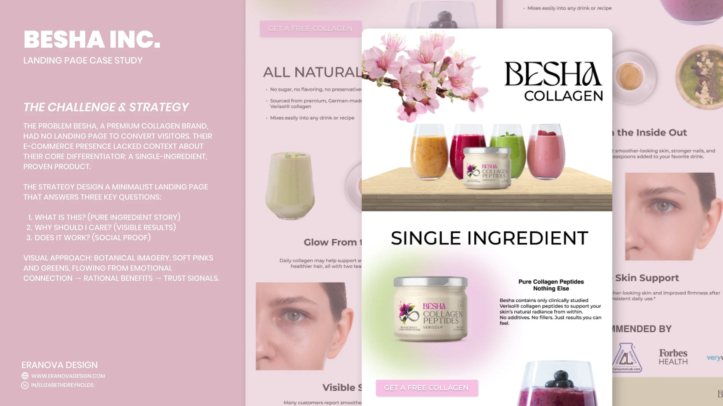
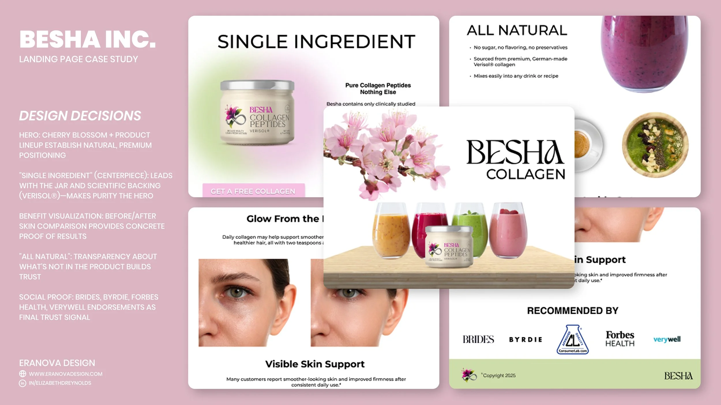
Each design element serves the conversion goal. The cherry blossom isn't decorative, it signals natural, botanical wellness. Leading with the jar (not lifestyle imagery) builds credibility through transparency. The before/after skin comparison is the trust-builder that moves browsers to buyers. By removing visual noise and letting each section breathe, I reduced decision fatigue and kept attention on what matters: the product and its results.
My Approach
I started by understanding why single-ingredient positioning is actually Besha's greatest asset in a market saturated with complicated formulas and health claims. Rather than hide that simplicity, I made it the hero of the page. This meant rethinking the typical supplement landing page structure, instead of leading with benefits, I lead with the ingredient story, then prove the benefits, then seal it with social proof. The flow mirrors how customers actually make purchase decisions in the wellness space
What I Learned
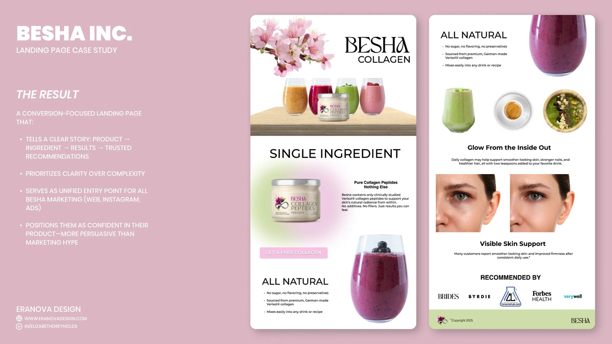
This project taught me that in wellness e-commerce, authenticity beats hype every time. Customers in this space are skeptical of over-claiming and marketing language, they want proof and transparency. By designing a page that feels confident rather than salesy, Besha positioned themselves as different from competitors. It also deepened my understanding of how to integrate a single web project across an entire marketing ecosystem, not just build a standalone page.

Every design choice is a decision. Every element should earn its place.
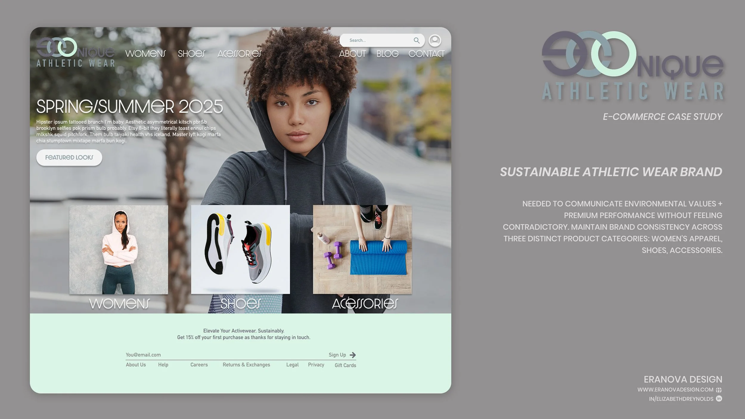

The Challenge
Econique is a sustainable athletic wear brand built entirely from hemp and renewable materials. The challenge was to design a cohesive e-commerce experience that communicates environmental values while maintaining a premium aesthetic across three distinct product categories, women's apparel, shoes, and accessories, without losing visual or navigational consistency.
The Strategy
Rather than make sustainability the visual hero, I positioned it as an underlying value that informed every design choice. The key was creating constraints that paradoxically allowed freedom: a limited but purposeful color palette, clear typographic hierarchy, and a consistent grid system that scaled across all pages. This ensured brand recognition instantly, whether a customer landed on the homepage, a category page, or a single product page.
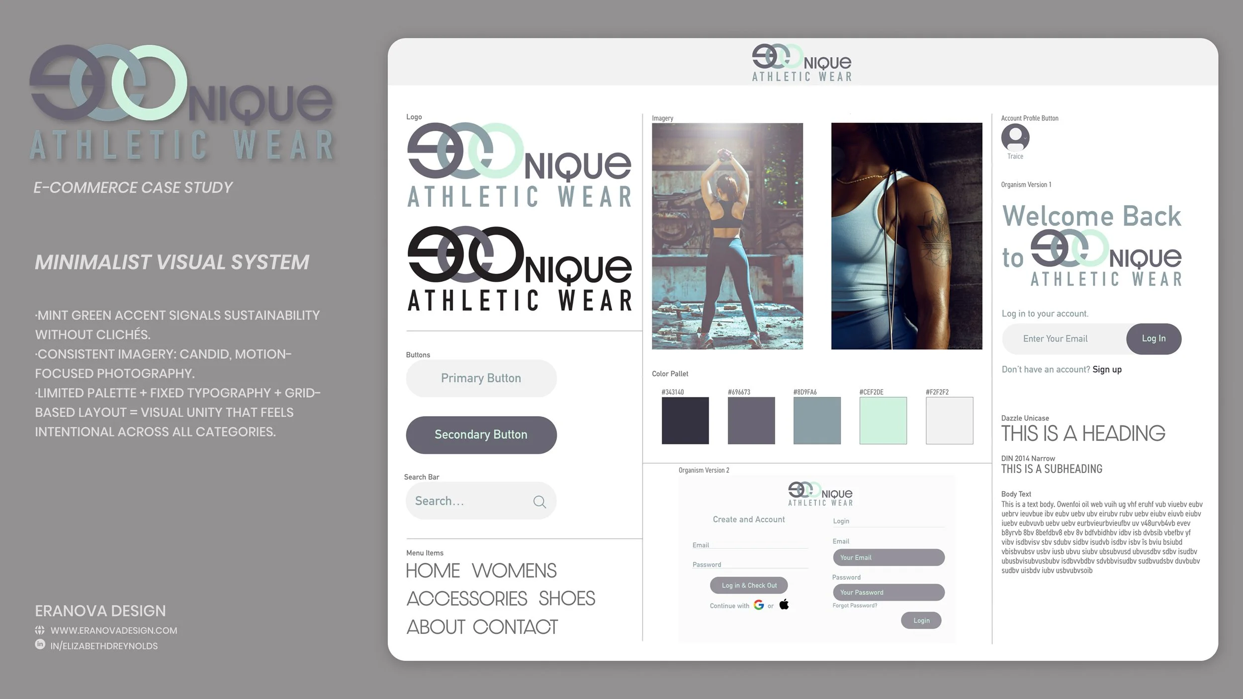
Design Direction & Key Decisions
The visual language reflects premium athleticism: moody, candid imagery that captures real movement and aspiration. The color palette charcoal, slate, and mint green, signals sustainability without relying on eco-clichés. Mint green appears strategically as an accent color (buttons, highlights, links) creating visual continuity across categories. The interlocking circle logo suggests both circular economy principles and athletic motion. Product pages maintain identical layouts across all three categories, consistency was critical so customers never felt they'd landed on a different website when moving between apparel, shoes, and accessories.
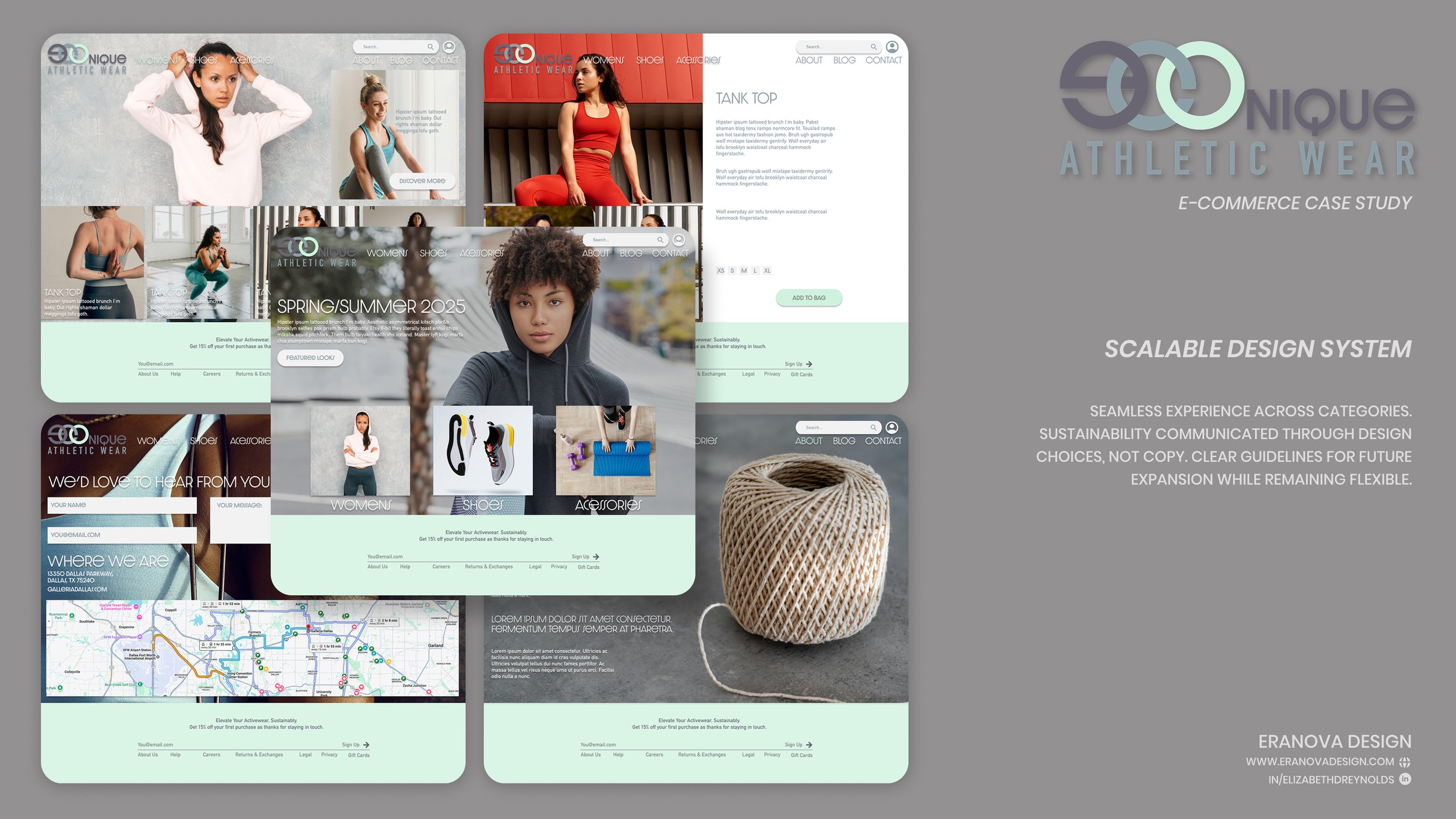
The Result
A fully cohesive e-commerce system where customers experience Econique the same way across every touchpoint. The design communicates premium quality and performance without compromising the sustainability narrative. The minimalist approach lets product and imagery do the talking, customers understand Econique's values through design choices rather than copy. The system is scalable: if Econique expands to new categories or seasonal collections, the established visual and navigational framework provides clear guidelines while remaining flexible.
What I Learned
This project taught me that brand consistency in e-commerce isn't about repetition, it's about creating a visual system with clear rules that feels inevitable, not restrictive. By establishing constraints early (limited palette, consistent typography, grid-based layouts), I created freedom within those boundaries. Every design choice had to answer: Does this support the brand? Does this help the customer? If not, it doesn't belong.
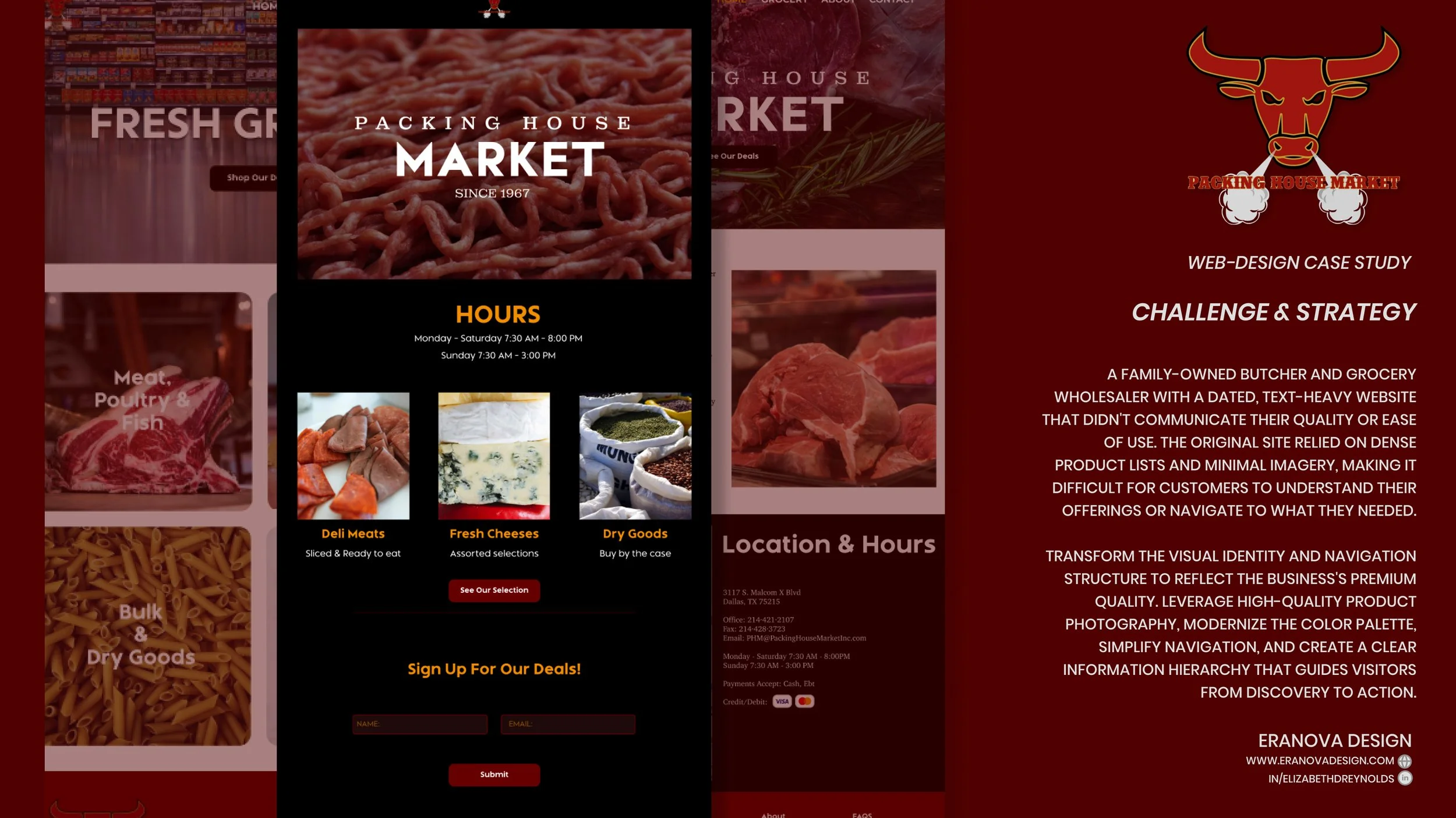
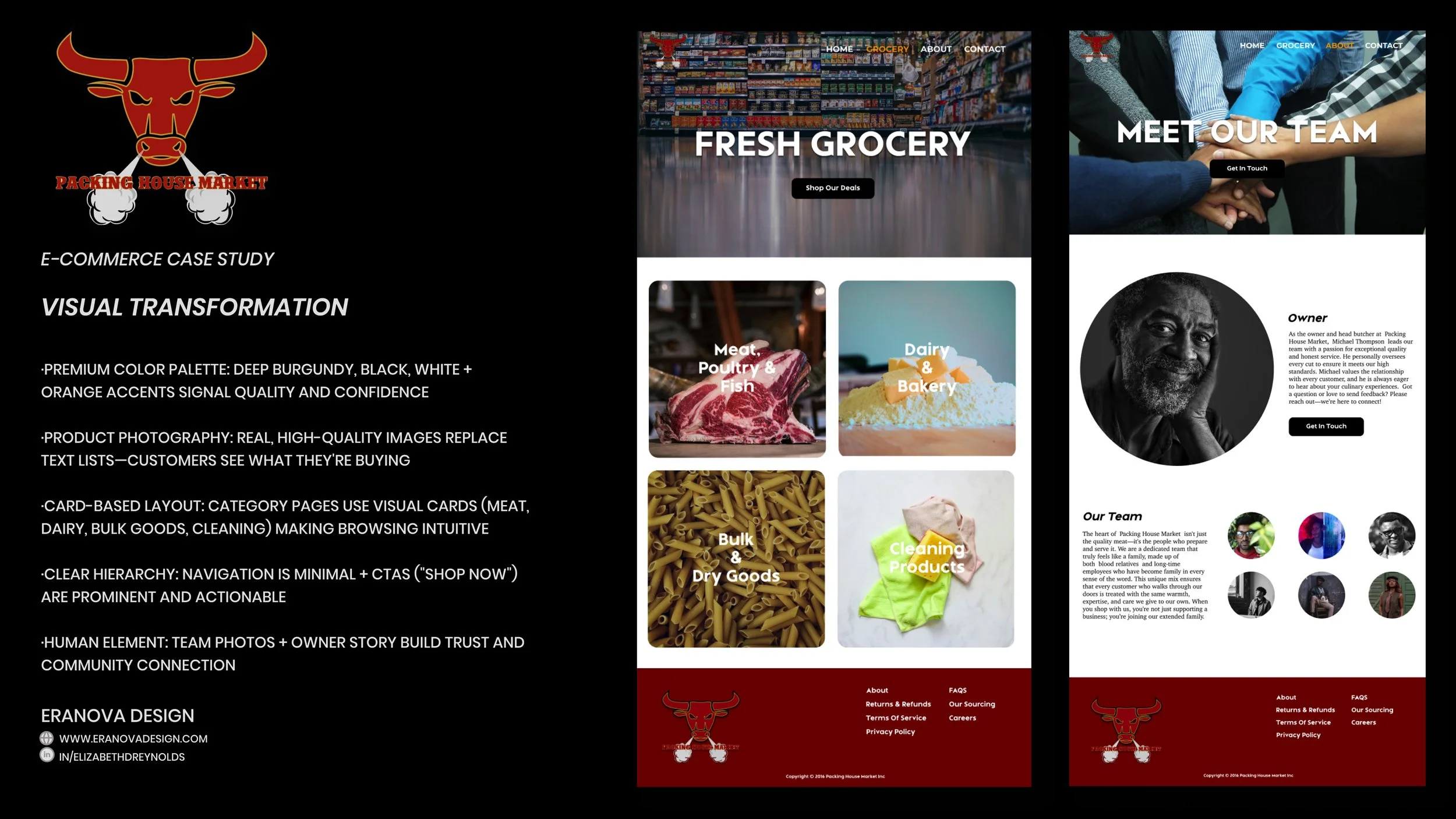
Rather than list products, I made them visual. High-quality photography of actual meat, dairy, and grocery items became the primary communication tool. The color palette, deep burgundy, black, white, with orange accents, conveys premium quality and confidence. Navigation was stripped down to essentials (Home, Grocery, About, Contact), and every page was redesigned around a clear information hierarchy: what they offer, who they are, how to contact them..
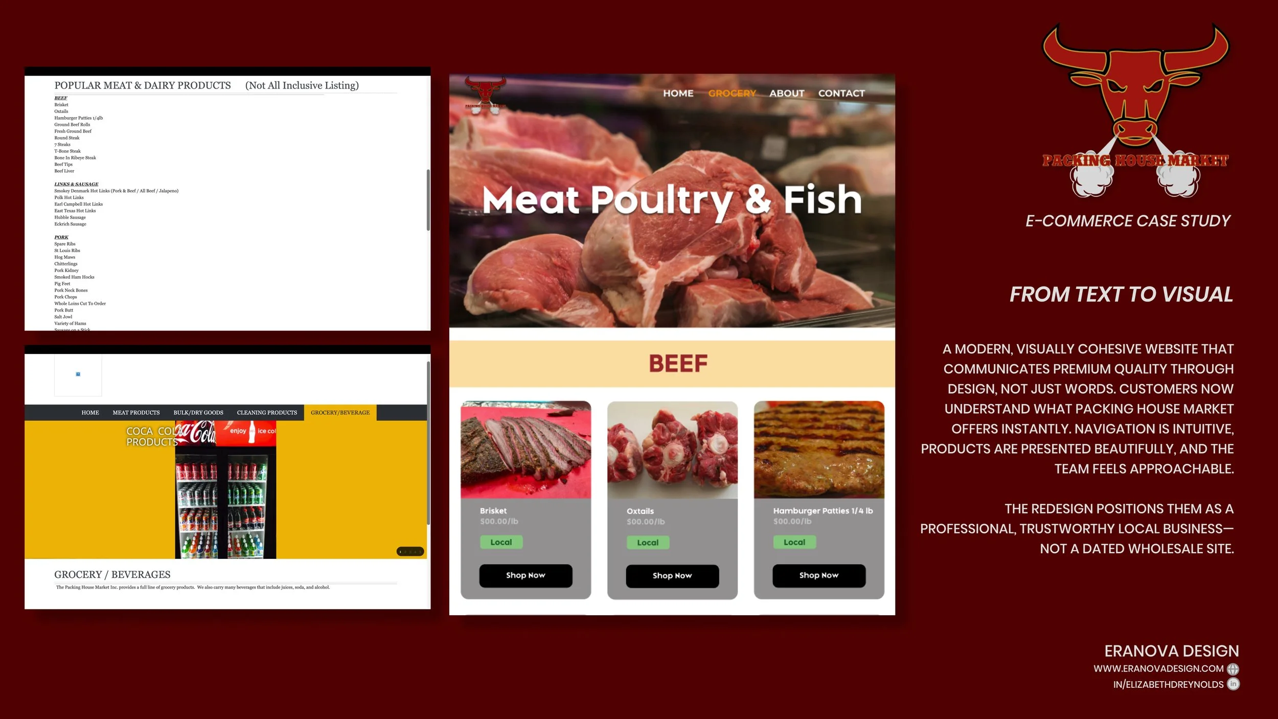
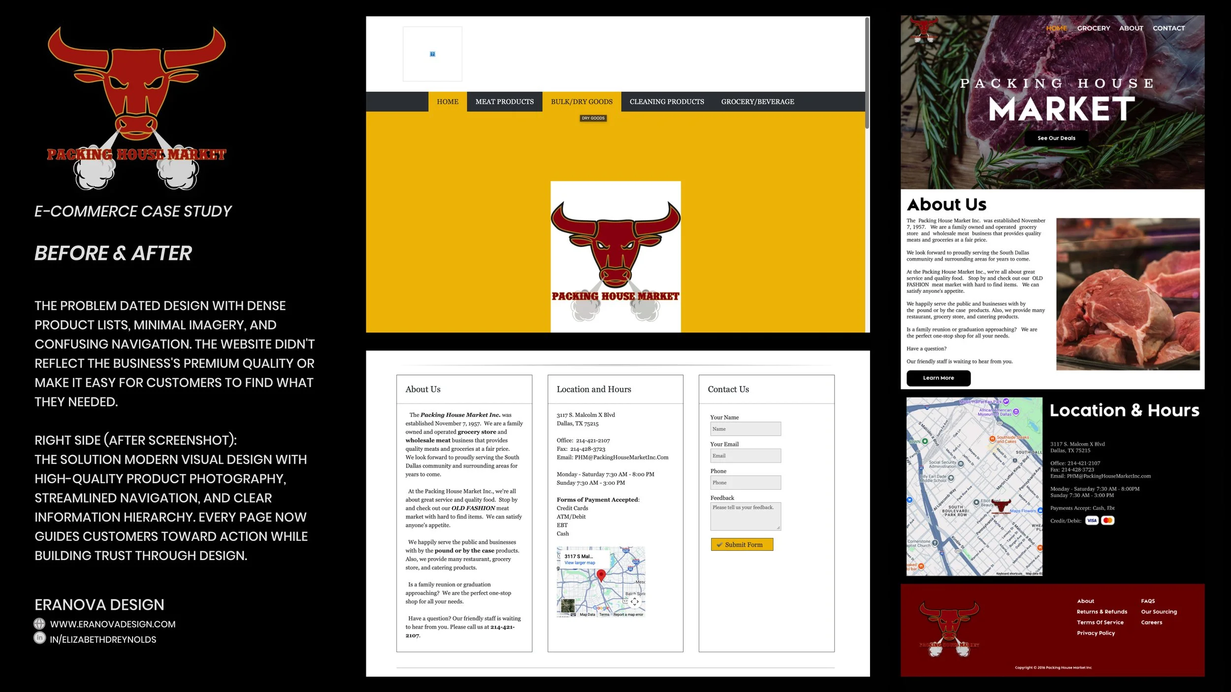
Packing House Market is a family-owned butcher and wholesale grocery business serving South Dallas since 1957. Their website failed to reflect their quality or accessibility. Dense product lists, minimal imagery, and confusing navigation meant customers couldn't easily find what they needed or understand the breadth of their offerings. The outdated design also didn't convey the professionalism and premium quality that defines the business.
Packing House Market is a family-owned butcher and wholesale grocery business serving South Dallas since 1957. Their website failed to reflect their quality or accessibility. Dense product lists, minimal imagery, and confusing navigation meant customers couldn't easily find what they needed or understand the breadth of their offerings. The outdated design also didn't convey the professionalism and premium quality that defines the business.
What This Achieved
A website that feels professional and modern while honoring the business's 65+ year history. Customers now understand Packing House Market's full range instantly. Product pages have clear pricing, sourcing information, and "Shop Now" CTAs. The team section humanizes the business. The result is a trustworthy, modern online presence that reflects the quality and care they bring to their work.