MY WORK
-

再生 (SAISEI) REGENERATION KANJI ART PRINT
Minimalist wall art combining authentic Japanese calligraphy with macro nature photography. The piece pairs the kanji for "regeneration" with weathered wood grain imagery, creating a visual meditation on resilience and renewal. Part of a collection bridging ancient Japanese wisdom with contemporary minimalist design.
DESIGN ELEMENTS:
Color palette: Deep black background, warm natural wood tones, copper-gold kanji
Typography: Traditional Japanese calligraphy (再生 - saisei/regeneration)
Photography: Macro detail of fractured tree rings with radial grain patterns
Layout: Vertical kanji placement, centered photographic element, high contrast composition
DESIGN STRATEGY: Created a conceptual piece where form mirrors meaning, the fractured wood grain becomes a metaphor for breaking and rebuilding. The radial patterns suggest both damage and the growth rings that mark time and survival. Black background provides dramatic contrast while allowing the organic textures to anchor the composition. Gold kanji adds warmth and cultural authenticity.
APPLICATION: Digital download art print, print-on-demand wall art (Etsy, Redbubble)
ROLE: Concept Development, Japanese Calligraphy Integration, Graphic Design
-
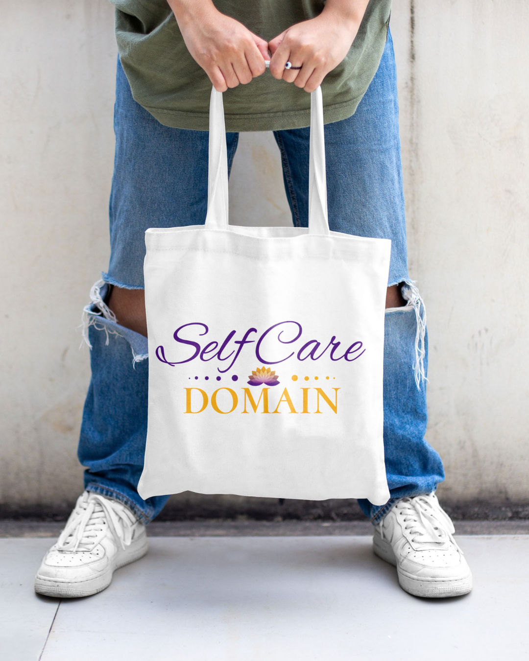
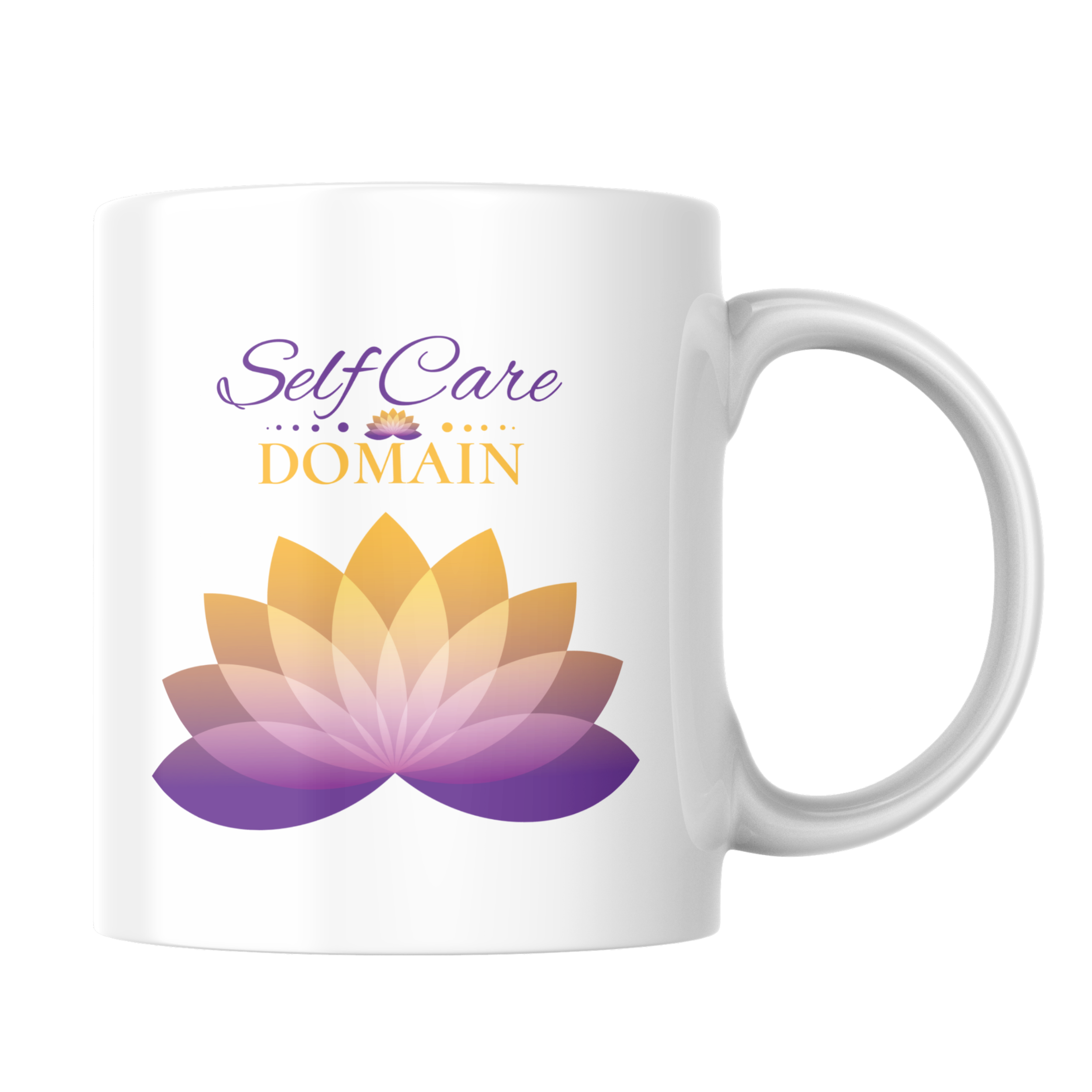
Self Care Domain — Branded Tote Bag Design
Merchandise design for Self Care Domain, a wellness brand. The tote bag combines elegant script typography with decorative elements to create a product that's both functional and aspirational, reinforcing the brand's message of intentional self-care as a lifestyle.
DESIGN ELEMENTS:
Color palette: Deep purple, warm gold on natural canvas
Typography: Flowing script for "Self Care," structured serif for "DOMAIN"
Decorative elements: Lotus flower icon, dotted accents
Layout: Centered, balanced composition for wearable merchandise
DESIGN STRATEGY: Created a design that works as both brand identifier and personal statement piece. The purple and gold palette conveys luxury and spirituality while remaining approachable. Typography contrast between script and serif balances feminine elegance with grounded authority.
APPLICATION: Canvas tote bag for retail/promotional use
ROLE: Brand Merchandise Design, Typography, Logo Application
-

Casino Night Event Poster — Bold Typography & Angular Design
Event poster for New Grand Casino Night fundraiser combining bold angular typography with casino imagery. The dynamic diagonal composition creates energy and movement appropriate for a social gambling event, while maintaining clear readability of essential event information.
DESIGN ELEMENTS:
Color palette: Rich gold, black, white for luxury casino aesthetic
Typography: Oversized condensed sans-serif at dramatic angles
Imagery: Playing card motifs anchoring corners
Layout: Diagonal text flow creating visual tension and excitement
DESIGN STRATEGY: Created immediate visual impact through scale and angle while ensuring event details (date, time, location) remain accessible. The gold and black palette evokes upscale casino atmosphere while the aggressive angles add contemporary edge.
EVENT DETAILS COMMUNICATED:
Event name and theme
Date, time, and location
Supporting organization information
DELIVERABLE: Large-format event poster
ROLE: Poster Design, Typography, Event Graphics
-

Alexs Bluebarrow Collection — Complete Brand Identity System
Comprehensive stationery suite for combining clean minimalism with a distinctive mustache icon. The brand identity balances professional polish with personality through strategic use of the iconic symbol and restrained navy-and-white palette.
DESIGN ELEMENTS:
Color palette: Navy blue, white, red accent signature
Brand icon: Stylized mustache mark as identity anchor
Typography: Modern sans-serif with elegant script signature
Applications: Letterhead, business cards, envelope, full stationery system
DESIGN STRATEGY: Created a cohesive visual identity system that works across all touchpoints. The mustache icon functions as both logo and decorative element, providing brand recognition while maintaining sophistication. Navy and white palette ensures versatility and professionalism across print applications.
DELIVERABLES:
Letterhead design
Business card (front and back)
Envelope design
Brand identity guidelines
ROLE: Brand Identity Design, Stationery System, Logo Application
-

Love Yourself (自愛して) — Japanese Character Wall Art
A departure from my brutalist series, exploring softer wellness themes through Japanese typography. This piece features 自愛して (jiai shite - love yourself), the imperative form that commands gentle self-compassion. Paired with handwritten script and textured color blocks in mauve and teal.
DESIGN ELEMENTS:
Typography: Japanese kanji 自愛して (love yourself - command form) + script lettering
Color palette: Dusty mauve, teal, cream
Texture: Linen effect for warmth
Style: Minimalist with emotional softness
CONCEPT: Part of a self-care themed collection that balances my typically harsh aesthetic with approachability. The imperative form creates a direct, personal reminder rather than abstract concept.
ROLE: Design, Typography, Art Direction
-
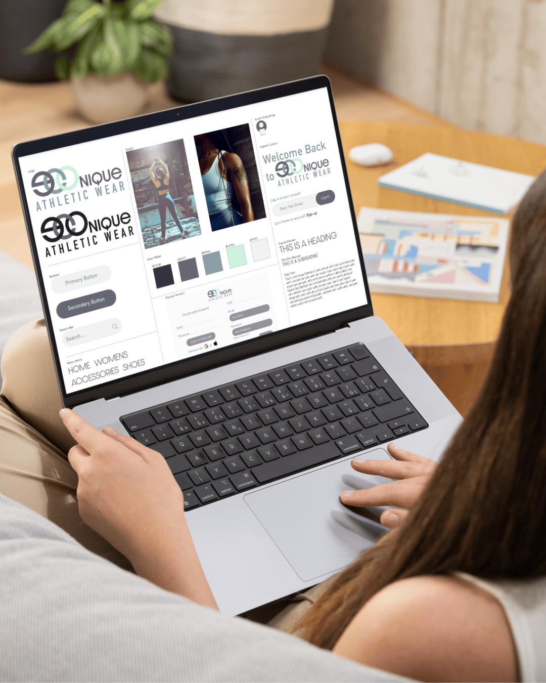
Econique Athletic Wear — Brand Identity & Web Design
Complete brand identity and website design for ECONique Athletic Wear, an activewear company. The project encompasses logo development, color system, photography art direction, and responsive web interface design for an e-commerce platform.
DESIGN ELEMENTS:
Brand identity: Modern logo with 3D icon integration
Color palette: Navy, charcoal, sage, mint, white for versatile athletic aesthetic
Photography: Lifestyle imagery showcasing product in action
UI/UX: Clean navigation, login interface, content hierarchy
Typography: Contemporary sans-serif for readability across devices
SCOPE OF WORK:
Logo design and brand mark variations
Color system development
Website wireframes and UI design
Navigation architecture
User login/account interface
Content layout and typography system
Product photography art direction
DESIGN STRATEGY: Created a cohesive digital brand experience that balances athletic performance with lifestyle appeal. Clean interface design prioritizes product discovery while maintaining brand consistency across all touchpoints.
ROLE: Brand Identity, Web Design, UI/UX Design, Art Directionlaunching or rebranding
-
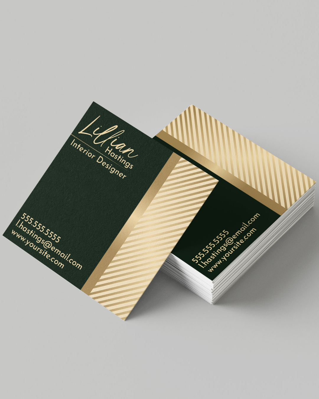
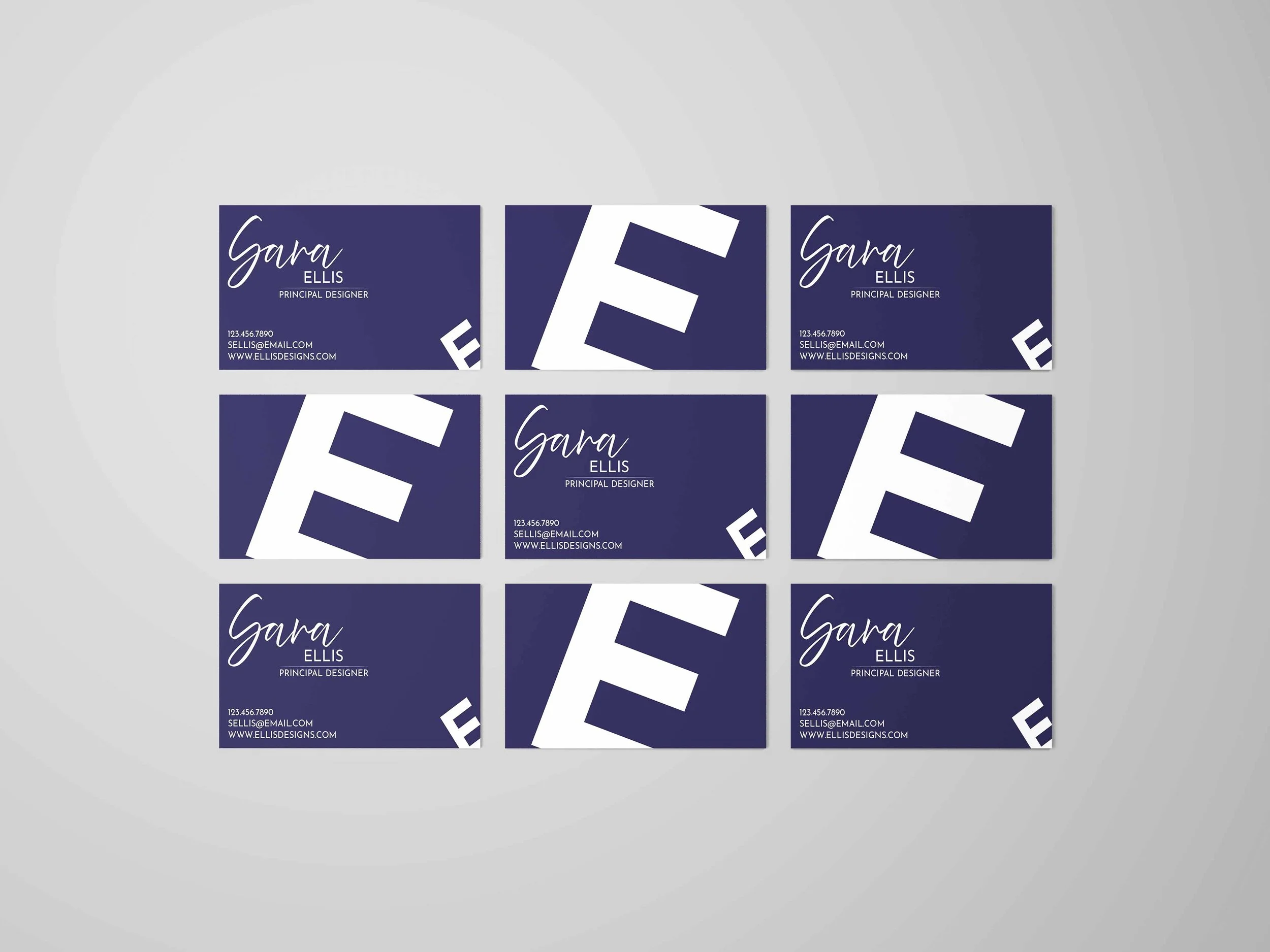
Lillian Hastings Interior Design — Business Card Design
Elegant business card design for an interior designer, balancing sophistication with approachability. The deep green and gold palette evokes luxury while the diagonal stripe pattern adds visual interest and modern refinement.
DESIGN ELEMENTS:
Color palette: Forest green, warm gold, cream
Pattern: Diagonal striped accent for texture and movement
Typography: Script for name (personality), sans-serif for contact info (clarity)
Layout: Asymmetric diagonal division creating dynamic visual flow
DESIGN STRATEGY: Created a premium feel appropriate for high-end interior design services while maintaining readability and professional polish. The diagonal stripe serves double duty as decorative element and brand signature.
SPECIFICATIONS: Standard business card size (3.5" x 2"), print-ready
ROLE: Brand Identity, Business Card Design, Typography
-

SAAACF Nonprofit Grant Program — Community Outreach Flyer
Informational flyer for the San Antonio Area African American Community Fund announcing grant opportunities up to $25,000 for eligible nonprofits. Designed in partnership with Vulcan Materials Company to communicate funding availability and drive applications from community organizations.
DESIGN ELEMENTS:
Color palette: Deep red, white, black for strong contrast and readability
Typography: Bold hierarchy with clear CTAs
Layout: Information-dense but organized with bullet points and sections
Photography: Community imagery showing diverse program impact areas
OBJECTIVE: Maximize grant applications by clearly communicating eligibility requirements, funding amounts, and key deadlines to nonprofit decision-makers in Bexar County and surrounding areas.
KEY INFORMATION COMMUNICATED:
Grant amounts and availability
Eligible focus areas (Arts & Culture, Education, Health, Youth Development, STEM)
Eligibility criteria
Application deadline and contact information
DELIVERABLE: Print flyer for distribution and digital sharing
ROLE: Graphic Design, Layout, Information Design
-
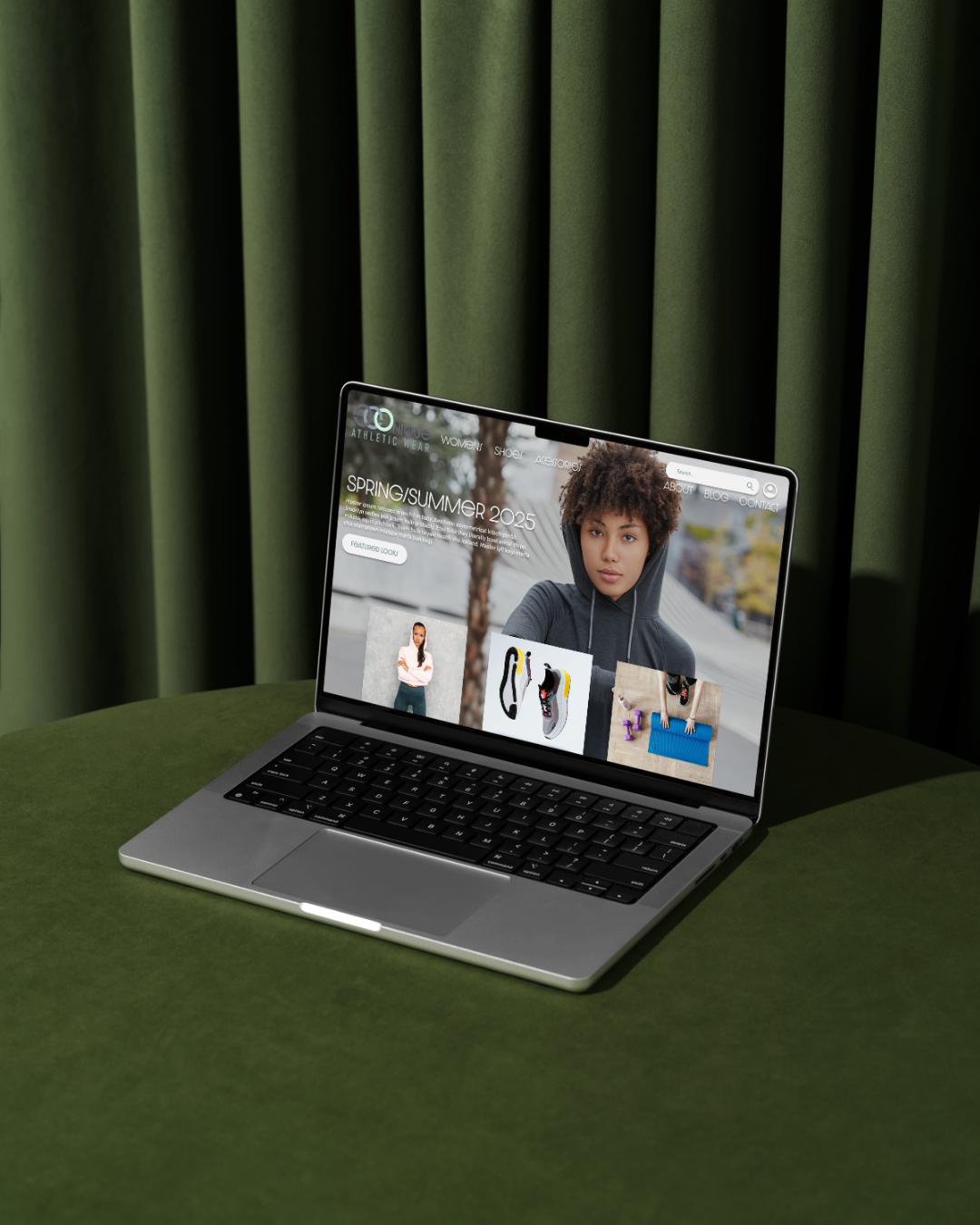
Econique Athletic Wear — Responsive E-Commerce Website
Fully responsive e-commerce website design for Econique Athletic Wear showcasing their Spring/Summer 2025 collection. The design emphasizes clean aesthetics, lifestyle photography, and seamless user experience across desktop, tablet, and mobile devices.
DESIGN ELEMENTS:
Brand identity: Minimal logo with clean typography
Color palette: Neutral grays, black, white for product focus
Hero section: Full-width lifestyle photography with seasonal messaging
Navigation: Clear category structure (Home, Women, Shoes, Accessories, About, Blog, Contact)
Product grid: Image-focused layout with CTA integration
Typography: Modern sans-serif for readability across all breakpoints
RESPONSIVE DESIGN: Created adaptive layouts optimized for desktop (1920px), tablet (1024px), and mobile (375px) viewports. Maintained visual hierarchy and brand consistency while ensuring touch-friendly interactions on smaller screens.
SCOPE OF WORK:
Homepage design and layout
Responsive breakpoints and mobile optimization
Navigation architecture
Product presentation strategy
CTA button design and placement
Photography art direction
ROLE: Web Design, UI/UX Design, Responsive Design, Art Direction
-

Yama · Kumo Kanji Wall Art
This series is a passion project born out of my personal journey learning the Japanese language. I believe that to truly understand a language, you have to respect and immerse yourself in the culture behind it.
I created this series as a way to become a more rounded person and to visualize the concepts I’m studying. I treat each piece as a visual meditation on a specific word. This design focuses on Yama (山), for "Mountain,” and Kumo (雲) for “Cloud”
Visual Concept
The goal for this series was to translate the essence of nature into visual form: capturing the stability and permanence of 'Mountain' (Yama) alongside the fluidity and impermanence of 'Cloud' (Kumo)
Typography: I utilized a brutalist, industrial font for the English text to give it weight and structure, contrasting it against the elegant stroke width of the Kanji.
Composition: The layout is strictly vertical and centered to create a sense of balance.
Symbolism: The geometric steps at the bottom serve as an abstract "reflection" of the mountain, grounding the design and adding a modern architectural element.
Deliverables
This project was finalized as a scalable, high-resolution digital art print.
Format: 8x10 (Scalable)
-

Athletic Brand Refresh — Complete Visual Identity System
Comprehensive brand refresh for a fitness facility, modernizing their visual identity to attract new members and strengthen market position. The project included complete logo redesign, expanded color system, typography guidelines, and templated social media assets for consistent brand application.
DESIGN ELEMENTS:
Logo: Redesigned brand mark with modern athletic aesthetic
Color palette: Updated system for versatility across applications
Typography: Structured hierarchy for print and digital use
Brand standards: Complete style guide for consistent implementation
DELIVERABLES:
Redesigned logo and brand mark variations
Updated color palette with usage guidelines
Typography system and hierarchy
Comprehensive brand style guide
Social media template suite for ongoing content
PROJECT TIMELINE: 2-3 weeks
TARGET MARKET: Gyms, fitness studios, sports facilities, wellness centers
ROLE: Brand Identity Design, Logo Design, Style Guide Development, Template Design
-
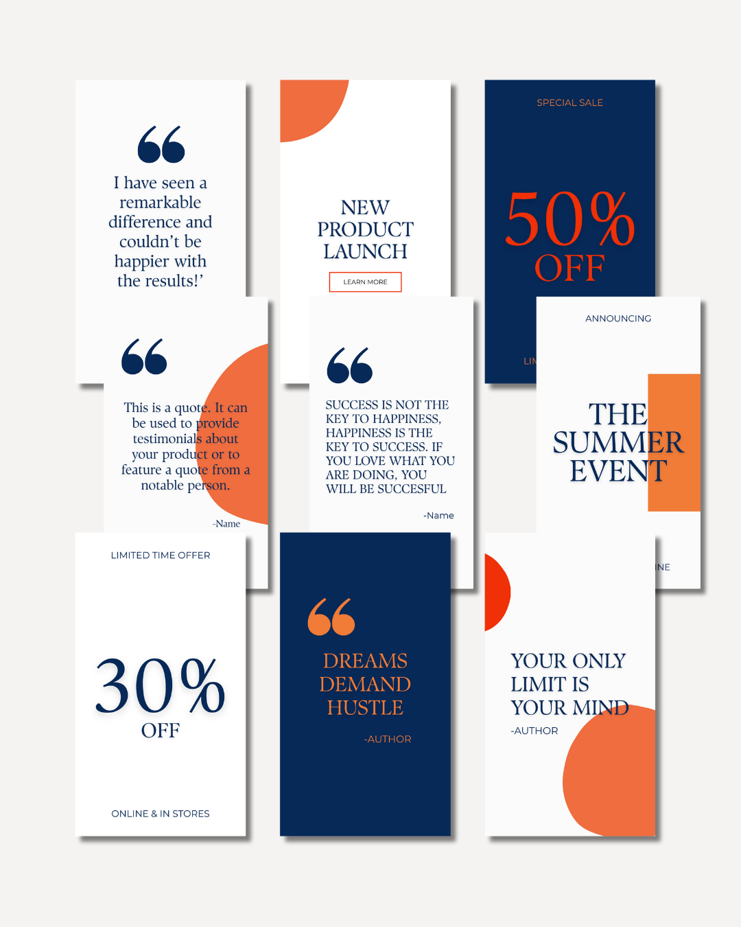
Coach & Consultant Social Media Template Suite
Editable social media template collection designed for coaches and consultants needing consistent brand presence without ongoing design support. The suite includes versatile templates for quotes, promotions, and educational content, all built in Canva for easy client customization.
DESIGN ELEMENTS:
Template variety: Quote posts, promotional graphics, tip/educational posts
Color system: Custom palette designed for brand cohesion
Typography: Curated font pairings for hierarchy and readability
Platform: Canva-based for client accessibility and ease of use
DELIVERABLES:
10 editable Canva templates
Custom color palette with hex codes
Font pairing recommendations
Template usage guidelines
PROJECT TIMELINE: 2-3 days
TARGET AUDIENCE: Coaches, consultants, small business owners seeking brand consistency without per-post design costs
ROLE: Social Media Design, Template Design, Brand System Development
-
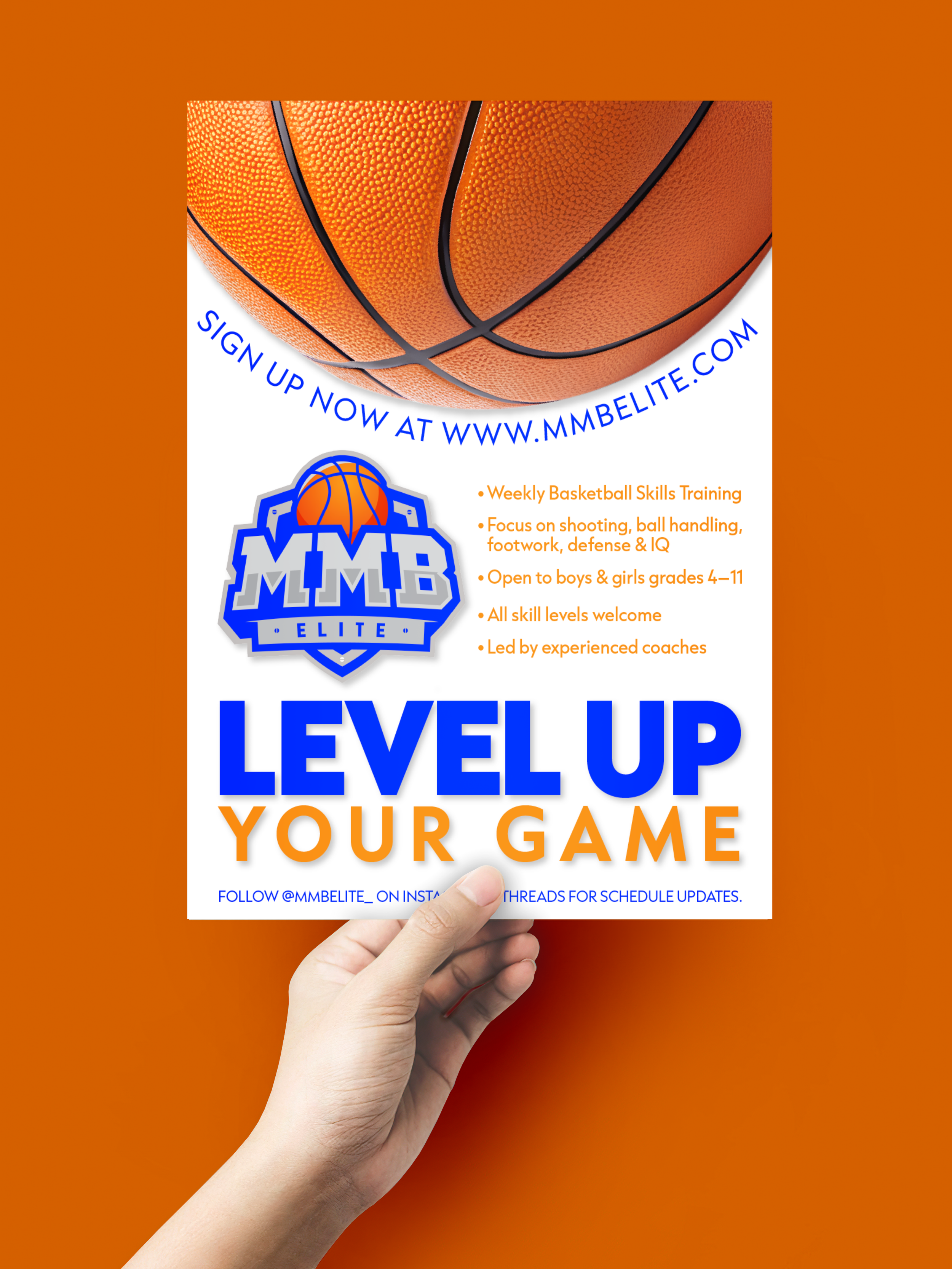
MMB Elite Basketball Training — Social Media Promo
Social media graphic for MMB Elite, a youth basketball skills training program. Created to drive sign-ups through clear messaging, bold typography, and energetic sports imagery that appeals to both young athletes and parents.
DESIGN ELEMENTS:
Color palette: Electric blue, vibrant orange, clean white
Typography: Bold sans-serif for impact, readable body text
Imagery: Dynamic basketball close-up with curved text treatment
Layout: Information hierarchy with bullet points for scannability
OBJECTIVE: Convert social media viewers into program registrants by communicating key benefits (skill development, inclusive age range, experienced coaches) with immediate visual impact.
DELIVERABLE: 1080x1440px Instagram/Facebook story format
ROLE: Graphic Design, Layout, Typography
More Design Work


READY TO START YOUR PROJECT?
Whether you need:
✓ Social media templates to maintain consistent branding
✓ Event flyers that grab attention and drive action
✓ A full brand identity or rebrand
✓ Website design that converts visitors to customers
I can help.
Starting rates:
- Social Media Template Packs: $50-75
- Flyers & Promotional Materials: $75-150
- Logo Design & Branding: $200-400
- Website Design: $500+
Let’s connect
Email: elizabeth@eranovadesign.com
Typical turnaround: 3-7 days depending on project scope