DESIGNED FOR HUMANS
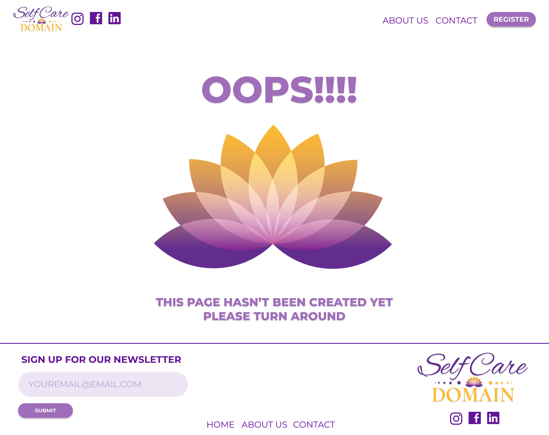
For the Women's Self-Care Conference landing page, I focused on designing a layout that clearly communicates the different ticket options while also making it easy for users to find directions to the event. The goal was to create a smooth, engaging experience that allows potential attendees to quickly understand their choices and feel confident in making a decision.
I emphasized clarity and simplicity throughout the design process, ensuring that navigation was intuitive and information was easy to digest. By removing unnecessary distractions, the layout guides visitors naturally toward the most important details without overwhelming them.
This clean and structured approach not only improves usability but also creates a visually appealing experience. It highlights the ticket options while maintaining a welcoming, professional tone that reflects the purpose of the conference.
Client: The Self Care Domain: Women’s Conference
Project Date: June 10th 2024
Role: Designer
Event Promotion
SUMMARY:
The goal of this project was to create a singular information page that is both informative and easy for users to navigate. The main challenge I faced was starting with no prior experience in building a fully functional design from scratch. This meant I had to learn how to balance usability with visual appeal, which required a thoughtful approach to planning and execution.
Because this was a school project, my research was limited, which added another layer of difficulty. I focused primarily on understanding design hierarchy, layout placement, and the psychological meaning behind colors. These elements were essential to ensure that the page not only looked good but also communicated effectively with users.
Another challenge was maintaining simplicity without making the design feel overly basic or uninspired. Striking the right balance between functionality and aesthetic appeal required careful decision-making about which features to include and how to present them clearly and logically.
THE CHALLENGE
To overcome these challenges, I approached the project with a focus on clarity and user-centered design. I started by creating a wireframe to plan the structure of the page, making sure that the layout guided users naturally from one section to the next. This step was crucial in building a strong foundation for both the visual design and the overall functionality.
I paid special attention to visual hierarchy, ensuring that key information like ticket options and directions stood out immediately. By strategically using typography, color, and spacing, I was able to create a layout that felt intuitive and easy to follow. My design choices were grounded in the idea that simplicity can be powerful when executed well.
Throughout the process, I continuously refined my design based on usability principles I learned in class. This included testing the flow of navigation, adjusting spacing for readability, and carefully selecting colors that aligned with the theme of self-care while remaining visually appealing..
THE SOLUTION
The final product was a visually appealing, functional, and user-friendly landing page. It featured a clean, streamlined layout that made navigation simple and effortless for users. Visitors could easily understand the available options and access important details without confusion or frustration.
Each design element was thoughtfully placed to enhance the overall experience, from the typography choices to the spacing between sections. The focus on hierarchy and color theory helped create a page that felt cohesive and professional, even within the constraints of a school project.
Ultimately, the result was a design that balanced aesthetics with practicality. It successfully demonstrated my ability to create a user-focused product that is both engaging and efficient, showcasing how thoughtful design can improve the way people interact with information online.
THE RESULTS
Through this project, I gained valuable experience in creating a functional, user-friendly design from the ground up. I learned how important it is to start with a strong foundation by focusing on hierarchy and layout planning. These elements are crucial in guiding users through information smoothly, and I realized that even small decisions, like where to place a button or how to size text, can have a big impact on usability.
I also discovered the importance of color theory and how different colors can influence mood and perception. By carefully selecting a color palette, I was able to support the theme of self-care while maintaining visual clarity. This helped me understand how design isn’t just about looking good, but also about communicating a message effectively.
Most importantly, I learned how to balance aesthetics with practicality. While I wanted the design to be visually appealing, I prioritized simplicity and ease of navigation. This taught me that great design is about solving problems for the user, not just showcasing creativity. Overall, the project gave me the confidence to approach future designs with both a critical eye and a user-focused mindset.


