Studio Window No. 13
How to choose images for your wellness brand
ELYSA - ERANOVA DESIGN JULY 13 2026 13 MIN READ FREE CHECKLIST INSIDE
Before your visitor reads a word of your copy, before she registers your logo or your color palette, she has already formed a feeling about your brand from your images. Photography is the fastest brand signal you have.
Most wellness practitioners treat images as decoration. Something to fill the empty space between the words. A nice photo here, a calming landscape there, something that looks professional enough to not embarrass the brand. The result is a website that looks assembled rather than designed, and a visual identity that communicates nothing specific about who you are and who you serve.
Your images are not decoration. They are brand communication. And the wellness space is one of the most visually competitive markets online, which means the practitioners who choose their images intentionally stand out immediately from the ones who do not.
This post covers everything you need to make better image choices for your wellness brand. The four types of images wellness brands use and when each one is appropriate. The five-step process for choosing images that actually match your brand feeling. The most common image mistakes that make wellness brands look generic. Where to find good images for free and paid. And how to build a consistent image library that works across your whole brand.
— WHY IMAGES ARE DOING BRAND WORK BEFORE YOUR COPY DOES —
Your images are making a first impression before your words get the chance
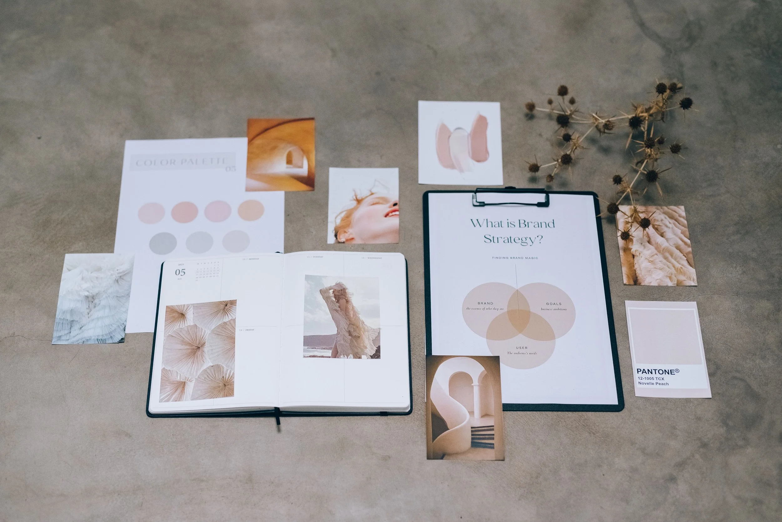
Research from 3M Corporation found that humans process visual information sixty thousand times faster than text. Before your visitor has read a single word on your homepage she has already formed an emotional response to your imagery. That response is either creating the feeling you want her to have about your brand or it is creating a different one entirely.
In the wellness space this matters even more than in other industries. Wellness clients are making deeply personal decisions. They are choosing someone to trust with their body, their nervous system, their mental health, their healing process. The feeling they get from your brand before they read anything is a significant part of what drives that trust. Or does not.
“Your images tell your brand story before your words do. The question is whether the story they are telling is the one you intend.”
This does not mean you need expensive brand photography before you can have a professional wellness brand. It means you need to be intentional about every image choice you make. A phone photo taken thoughtfully in good natural light tells a more honest brand story than a generic stock image that has nothing to do with your actual work or your actual clients.
— THE FOUR TYPES OF IMAGES WELLNESS BRANDS USE —
The four types of images and when to use each one
Every image on your wellness website falls into one of four categories. Understanding what each type communicates and when it is appropriate will help you make more intentional choices about what belongs where.
Photos of you, your workspace, your process, and your environment. This is the most powerful type of image for a personal wellness brand because it shows the real person behind the work. Brand photography builds trust faster than any other image type because it removes the anonymity that makes online purchasing feel risky. It does not need to be expensive. A well-lit phone photo taken with intention communicates more than a generic studio headshot.
Photos that represent the feeling of your brand rather than the literal content of your work. A woman reading in morning light. Hands wrapped around a tea cup. A slow walk through a quiet space. Lifestyle imagery communicates the world your brand lives in and the experience your client can expect. It works best when it is specific enough to feel intentional and not so generic that it could belong to any wellness brand.
Photos of your physical or digital products. For wellness brands selling templates, journals, printables, or physical goods, product photography is what converts browsers into buyers. Clean, well-lit, and styled to match your brand palette. A product photo that looks professional communicates that the product itself is worth the investment. A product photo that looks rushed communicates the opposite regardless of how good the product actually is.
Licensed images from photo libraries. Stock photography is a legitimate and practical tool for wellness brands, particularly when you are building your brand before you have the budget for professional photography. The risk is genericness. The wellness section of every major stock library contains the same images. Choosing stock that is distinctive, specific to your audience, and consistent with your visual palette takes more time but produces a significantly stronger result.
— HOW TO CHOOSE IMAGES THAT MATCH YOUR BRAND FEELING —
The five step formula for choosing images that actually work
The biggest mistake wellness practitioners make when choosing images is starting with the image itself. They browse a stock library, find something beautiful, and use it. The problem is that beautiful is not the same as on-brand. Here is the process that produces a more intentional result.
Before you open a single photo library, write down three to five words that describe how you want someone to feel when they look at your brand. Grounded. Spacious. Quiet. Luxurious. Raw. Earthy. Soft. These words are your filter for every image decision you make. If an image does not create at least one of those feelings it is not right for your brand regardless of how much you like it in isolation.
If your wellness brand serves women of color, your images should include women of color. If your brand serves older women, your images should reflect that. The people in your brand imagery are a signal to your ideal client about whether this brand is for her. If she cannot see herself in your images she will not believe your services are for her either.
Every image you use on your website should feel like it belongs to the same visual world as your brand colors. This does not mean every image needs to contain your exact brand colors. It means the overall tonal quality of your images should harmonize with your palette. Look at the dominant tones in each image and ask whether they sit comfortably alongside your brand palette before you use it.
A photo of a woman journaling that feels rushed and clinical is worse for your brand than a photo of an empty chair in warm morning light that creates exactly the feeling you want. The subject matter of an image matters less than the mood it creates. When you are choosing between two images that both show a similar subject, always choose the one that creates the stronger feeling, not the one that shows the most relevant content.
Individual images that are all beautiful but visually unrelated to each other do not create a brand. They create a mood board. Before you finalize any set of images for your website or social media, lay them all out together and look at them as a group. Do they feel like they belong to the same visual world? Is there a consistent quality of light, a consistent color temperature, a consistent level of intimacy or distance? If not, edit the set until it feels cohesive.
— THE MOST COMMON IMAGE MISTAKES IN WELLNESS BRANDS —
The mistakes that make wellness brands look generic and unintentional
— WHERE TO FIND GOOD IMAGES —
Where to find images that actually work for wellness brands
You do not need a large budget to find good images for your wellness brand. But you do need to know where to look and how to filter what you find. Here is a breakdown of the most useful sources across free and paid options.
- Unsplash — unsplash.com — the highest quality free stock library available. Strong for lifestyle and nature imagery. Search by feeling or color rather than subject for better results. All images are free for commercial use.
- Pexels — pexels.com — a strong alternative to Unsplash with a wider range of subjects and a more diverse image library. Also free for commercial use.
- StockSnap — stocksnap.io — a smaller but well-curated free library. Worth checking when Unsplash and Pexels do not have what you need.
- Canva free library — if you are using Canva for design, the built-in image library has improved significantly and includes free images suitable for wellness brands.
- Adobe Stock — stock.adobe.com — included with any Adobe Creative Cloud subscription. Enormous library with strong search filters including color and mood. The quality ceiling is higher than free libraries.
- Canva Pro library — significantly larger than the free library with more distinctive and less generic options. Worth the subscription if Canva is your primary design tool.
- Creative Market — creativemarket.com — sells curated photo packs rather than individual images. Useful for building a cohesive set that already feels intentional.
- Brand photography — investing in even one half-day professional photography session gives you a library of images that are entirely yours, entirely on-brand, and entirely distinctive. It is the single highest-return investment a personal wellness brand can make in its visual identity.
— BUILDING A CONSISTENT IMAGE LIBRARY —
How to build an image library that works across your whole brand
Having individual good images is not the same as having a cohesive image library. Here is how to build a set of images that works together consistently across your website, your social media, your products, and your marketing.
- Build a mood board before you search. Collect eight to twelve images that represent the exact visual feeling you want your brand to create. Use this as your reference point for every image decision going forward.
- Save everything to a dedicated brand folder. Create a folder called Brand Images and only put images that have passed your visual filter into it. Never pull images from outside this folder for brand use.
- Apply a consistent edit. If you are taking your own photos, use the same preset or filter on everything. If you are using stock, choose images with a similar quality of light and color temperature so they feel like they belong to the same shoot.
- Review the full set together before you publish. Lay all your images out at thumbnail size and look at them as a group. Edit until the set feels cohesive. The image that does not belong is always obvious when you see everything together.
- Audit your image library every six months. Your brand evolves. Images that felt right when you launched may no longer fit the direction you are moving toward. A periodic audit keeps your visual identity current.
The How To Series Workbook 02 brings the full brand design guide together into one complete resource. Coming soon to Gumroad.
Browse the collection