Studio Window No. 07
How to choose colors for your wellness brand
ELYSA - ERANOVA DESIGN JUNE 1 2026 12 MIN READ
Color is the first thing someone feels about your wellness brand. Before they read your headline, before they see your logo, before they understand what you do. They feel your colors. And that feeling either builds trust or breaks it.
If you have ever looked at your website or your business card and felt like something was off without being able to name what, there is a good chance it is your color palette. Not because your colors are ugly. But because they are communicating the wrong feeling to the wrong person.
This post is a complete guide to choosing brand colors for your wellness business. We are going to cover the psychology behind color in wellness branding, the specific color families that work best for different types of wellness practices, how to build a five color palette from scratch, and the most common color mistakes wellness brands make and how to fix them.
By the end you will know exactly how to choose brand colors for your wellness business. And more importantly, why each choice matters.
— WHAT THIS LOOKS LIKE IN PRACTICE —
Color is not about aesthetics.It is about trust.
Most wellness business owners approach brand colors the same way they approach decorating a room. They choose what they like. What feels pretty. What matches the mood board they saved on Pinterest last Tuesday. And the result is a brand that reflects the practitioner rather than speaking to the client.
Here is the shift that changes everything about how you approach color for your wellness brand. Your brand color palette is not about what you like. It is about what your ideal client needs to feel before she trusts you enough to book.
Research on color psychology in branding consistently shows that color is one of the primary signals people use to make rapid trust assessments. Before a visitor on your wellness website reads a single word they have already formed an impression based on your color choices. That impression either opens them up to what you have to say or creates resistance before the conversation even begins.
For wellness brands specifically this is even more pronounced. Your client is often coming to you in a vulnerable state. She is looking for safety, expertise, and a sense that you understand her. The wrong color palette, the one that feels clinical, chaotic, or generic, signals the wrong things before you have said anything at all.
“The right color palette does not describe your brand. It makes your client feel something before a single word is read.”
— COLOR PSYCHOLOGY FOR WELLNESS BRANDS —
What each color family communicates in wellness branding
Different color families send different emotional signals. Understanding what those signals are for your specific wellness niche is the foundation of choosing brand colors that actually work. Here is a breakdown of the five main color families used in wellness and holistic brand design and what each one communicates to your ideal client.

Mood Board
— HOW TO BUILD YOUR WELLNESS PLAN COLOR PALETTE —
The five color framework for wellness brands
Understanding color psychology is the first step. The second step is knowing how to build a palette that actually works together. Here is the five color framework I use for every wellness brand color palette. Whether I am designing a landing page template, a business card, or a full brand identity system.
Your base is the color that covers the most surface area in your brand. Your website background, your document backgrounds, your social graphic backgrounds. It should always be a neutral. Warm off white, soft cream, warm linen, or bone are the strongest choices for wellness brands. Never pure white. Pure white reads as clinical and cold in a wellness context. It belongs in a hospital, not a healing space.
This is your brand color. It appears on your buttons, divider lines, eyebrow labels, and key highlights. It should connect emotionally to what your ideal client needs to feel. Refer to the color psychology section above and choose the color family that best matches your specific wellness practice and the emotional signal you most need to send.
A deeper or lighter version of your primary accent. This gives your palette depth and flexibility without introducing a completely new color family. Your secondary accent appears on hover states, secondary buttons, section backgrounds, and anywhere you need a variation of your primary color without repeating it exactly.
Never use pure black for your body text in a wellness brand. Pure black feels harsh and clinical against a warm neutral background. Instead choose a very dark warm brown or near black, something dark enough to be readable at small sizes but warm enough to feel human. This small detail makes an enormous difference to how your overall palette feels.
A mid tone between your base and your text color. This is the color for body copy, captions, supporting text, and secondary information throughout your brand. It does the quiet work of your palette. Present everywhere but never demanding attention. Think of it as the color your brand whispers in rather than shouts.
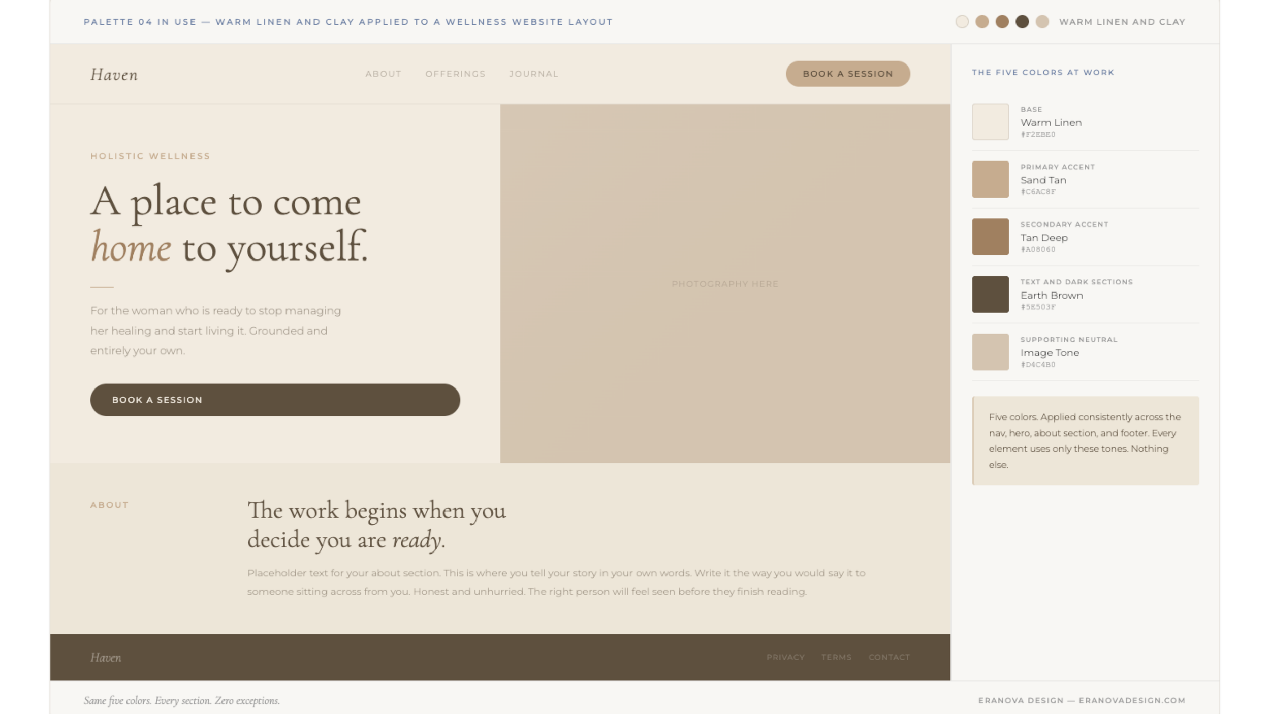
Color palette in use
— THE MOST COMMON COLOR MISTAKES WELLNESS BRANDS MAKE—
Color mistakes that make wellness brands look unprofessional
Even with good intentions and good taste most wellness business owners make a handful of consistent color mistakes that undermine the credibility of their brand. Here are the most common ones and how to fix each of them.
— THE MOST COMMON COLOR MISTAKES WELLNESS BRANDS MAKE—
Applying your wellness brand color palette consistently
Choosing your five colors is only half the work. The other half is knowing where each color lives across every touchpoint of your brand. Here is a simple system for applying your wellness brand color palette consistently.
- Base color: website background, document backgrounds, social graphic backgrounds, email backgrounds
- Primary accent: buttons, divider lines, eyebrow labels, key headline words, border accents on cards
- Secondary accent: section background variations, hover states, secondary buttons, card borders
- Text color: all body copy, headings on light backgrounds, navigation links, form labels
- Supporting neutral: supporting body copy, captions, secondary information, placeholder text
Once you have this system in place the question of which color to use in any given situation becomes straightforward. You are not making a new decision every time you design something. You are applying a system you have already decided on. That consistency is what makes your wellness brand feel professional and trustworthy rather than assembled on the fly.
The final thing worth saying about color consistency is this. Consistency over time is more powerful than perfection immediately. A wellness brand that uses five colors consistently for two years will feel significantly more established and trustworthy than one that uses a perfect palette inconsistently. Choose your colors thoughtfully, define where each one lives, and then apply that system every single time without exception.
The Eranova Design template collection is built on every principle in this guide. Every palette chosen with your wellness buyer in mind.
Browse the templates